Monday, February 20, 2012

Studio and Garden: At the Met: John F. Kensett, Minimalist


Studio and Garden: At the Met: John F. Kensett, Minimalist: Sometimes we are reawakened to an artist's work by seeing it in a new context, which scrubs our eyes clean and opens a space in our mind. This happened to me during my recent visit to the Metropolitan Museum of Art's new American Wing. In a gallery devoted to 19th century landscape painters, one stood out for me in a startling way: John Frederick Kensett. It's as though I saw a completely new painter, one who looked at the world with a sense of its essential nature, and who left the extraneous behind. A painting: sea and sky, the light of sunset gently touching the waves, the only diagonals barely traced in the upper sky. A painting full of light, but not drama; an everyday glory.


Eaton's Neck, Long Island, 1872; oil on canvas, 18 x 36 in.


A curve of beach and hillock sweep into the space of sky and sea, each element in perfect balance.


Eaton's Neck, detail


Kensett's touch is restrained yet visible, alive in its descriptive power.


Twilight on the Sound, Darien Connecticut, 1872; oil on canvas, 11 1/2 x 24 1/2 in.


Another still sunset, with elements separated by treed masses, a human trace in the floating boat.


Passing Off of the Storm, 1872; oil on canvas, 11 3/8 x 24 1/2 in.


This painting is a marvel of light and air. Clouds are reflected in water of nearly the same hue, yet each is itself: the water transparent and reflective, the clouds indefinite masses. Three simple rectangles make up the composition: water, dark clouds, and the bright band above them.


Passing Off of the Storm, detail.


Small details of boats, a fisherman, a bird taking flight, are added with quick strokes of the brush; they seem to hardly be there at all, just brief touches on the landscape.


A Foggy Sky, 1872; oil on canvas, 30 1/2 x 45 3/4 in.


Salt Meadow in October, 1872; oil on canvas, 18 x 30 in.


I photographed the first four paintings above at the museum, then went to the Met's Kensett website page to see if I could find additional works that fit the feeling I had that day of a painter using minimal means to express a great deal. I found the two paintings above, which are not on view in the galleries, but in the study collection, so I will try to see them on my next trip. In preparation for writing this post, I pulled my Kensett book, John Frederick Kensett: An American Master, from my studio bookshelf. It wasn't until then that I realized that all the work I'd been so drawn to were part of what is known as Kensett's "Last Summer's Work", a group of 39 paintings that he completed during a three month period in 1872, mainly around his Darien, Connecticut studio on Contentment Island, an amazing achievement. Tragically, Kensett died a few months later, and in 1874 his brother gave this group of paintings to the Metropolitan Museum, many of which are still in the museum's collection. I can't help but wonder how his work would have developed if he had lived; would he have continued to be inspired by the spare landscape on the Long Island Sound, and emptied his paintings even more of incident? In his Last Summer's Work, Kensett has left us paintings which are quietly attentive to specifics of light and landscape, and through that very sensitive attention transcends them.

Thursday, February 16, 2012

Emmett Kerrigan


Saw the beautiful paintings of Emmett Kerrigan at Linda Warren Gallery. They look so much better in person than in these images, very Wayne Thiebaud and very Chicago. He actually draws with with the paint, it's so thick.


Art Sinsabaugh


http://www.stephendaitergallery.com/dynamic/artwork_display.asp?ArtworkID=3442

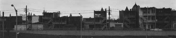
I'm really enjoying the work of photographer Art Sinsabaugh. His long Chicago landscapes don't have the usual dimensions of photography or painting-- something I want to try to do in my own work.

Wednesday, February 08, 2012

Monday, February 06, 2012

Edward Bieberman


Conspiracy, 1955.


From the LACMA website:

Edward Biberman was born in Philadelphia in 1904; both he and his older brother Herbert, expected to join the family garment business, wound up pursuing careers in the arts (Herbert as a writer for stage and screen). Edward began his career in Paris in the late 1920s, and subsequently settled in New York where he was included in on of the first exhibitions at the newly opened Museum of Modern Art. In 1936 he moved to Los Angeles, where he increasingly incorporated social concerns into his paintings. He also began making mural paintings and taught at the Art Center School. His social and political consciousness was heightened by the Spanish Civil War and the international rise of fascism. Even his portrait subjects, including Lena Horne and Paul Robeson, reflected his political leanings.

Biberman’s career was put on hold for five months in the early 1950s when his brother Herbert, one of the Hollywood Ten, was imprisoned for his refusal to cooperate with the House Un-American Activities Committee. The experience of living in Los Angeles during this politically charged period profoundly influenced Biberman, whose work of these years – including Conspiracy – clearly reflects the political realities of the day. Although he resigned from the Art Center School (in anticipation of dismissal for his political beliefs), he continued to teach throughout southern California. Biberman lived and worked in Los Angeles, known locally but largely ignored on the national art scene, until his death in 1986.


White Fire Escape, 1956.

Tuesday, January 24, 2012

The New Neurotic Realism


I checked out a book from the library today titled The New Neurotic Realism. It is a collection of images from a show in 1998 at the Saatchi Gallery in London. A lot of the work still holds up:


These pieces by Brian Cyril Griffiths are made out of cardboard boxes, office bins, bottle caps, and household objects like egg cups and tea strainers.


This chair by Andreas Schlaegel is made from kitchen sponges. Seems sort of related to the Brian Griffiths piece, but also like a modern day Fur Tea Cup:


Object in Fur, Meret Oppenheim 1936.


People are still making work like this painting by Dan Hays- paintings influenced by warped new and old digital images.

Dissolve, 1998.


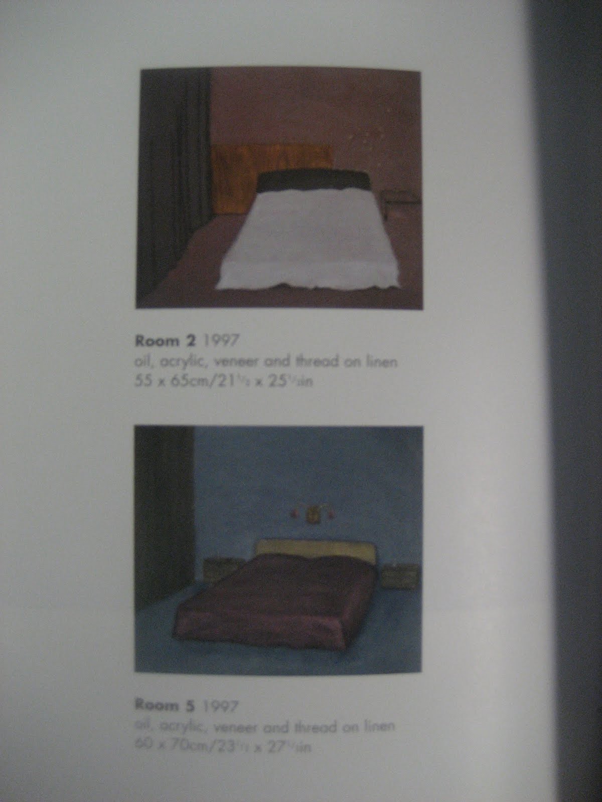
These Michael Raedecker drawing-painting hybrids are a mix of painting and sewing. From 1998, but still super contemporary and exciting!


Room 2 and Room 5, 1997.

Perspective, 1997.

Frisson, 1997.


Thursday, January 19, 2012

Beautiful paintings by Lois Dodd


An installation view of Lois Dodd's "New Panel Paintings"

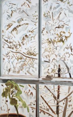
An eighty-four-year-old woman paints a view of falling snow from a window. That’s Lois Dodd.

Dodd has her ninth solo exhibition, titled New Panel Paintings, at the Alexandre Gallery in midtown Manhattan. The 24 new were were done plein air. Each painting is completed in one sitting.

Dodd paints what she sees: a green scrap of grass leading to a cottage, a yellow field bathed in sunshine, a red flower in bloom. To view a Dodd painting is to contemplate a singular moment in time. There is not fuss, but delight. Pure and simple.


Source:

Wednesday, January 18, 2012

I just discovered this clever Byron Kim painting today


Byron Kim
After Sun in an Empty Room, 2008
Oil and alkyd on canvas
31 x 132 inches


Which is referring to this Hopper painting:


Edward Hopper
Sun In an Empty Room, 1963
28 3/4 x 39 1/2 inches
oil on canvas


Monday, January 09, 2012

Who Owns the Color Red?


I will make my students read this!


Who Owns the Color Red?:

Louboutin shoes (via christianlouboutinsau.com)

Can a person own a color? Yves Klein may say yes, but Yves Saint Laurent begs to differ. Over the course of the past year the luxury goods company has been tied up in legal proceedings against the shoe designer Christian Louboutin, who believes his signature red-soled shoes are being ripped off by YSL. In my mind, this fashionable fighting has sparked speculation over the constant accusation of plagiarism that plagues creative fields.

In August a New York district court denied the preliminary injunction Louboutin requested against YSL’s ruby-bottomed pumps under the opinion of Judge Victor Marrero that a designer cannot have a monopoly on a color, nor did he believe consumers would be somehow tricked into thinking that the YSL shoes were Louboutins. Even though court will reconvene on January 24 because Louboutin just can’t give it up, I have to say the entire argument sounds petty and, to be blunt, a little selfish.

Now, even though I’ve been attempting for years to trademark the lovely shade of aubergine the circles under my sleep-deprived eyes are with little victory, this is not a personal vendetta against ownership of certain design elements. Tiffany, for example, has their turquoise (Pantone number and all) copyrighted, and the late Yves Klein patented his particular shade of blue. However, Klein’s patent on International Klein Blue had more to do with his chemical invention of the color, and Tiffany’s trademark applies only to competing brands because of the jewelry company’s long association with the specific color. Those are valid reasons to request protection, legally speaking, because they’re more or less aspects of brand identity that influence consumers. But most companies, as well as artists, seem to rapidly expect ownership and credit to any and all aspects of their creations, when in actual fact the color of a sole is no more grounds to sue than, say, a particular style of painting or sculpture.

Picasso's Les Desmoiselles D'Avignon (1907) (via moma.org) and an image of an African Fang Mask (via Wikipedia.org) (click to enlarge)

This constant quibbling over who owns what reminds me, inevitably, of the criticism (and lawsuits) constantly hurled at artist Shephard Fairey. Designer of the “Obama Hope” posters (which I’m hoping pop up again after the New Hampshire debates), Fairey’s signature style is one of appropriation and repurposing of images, much like Andy Warhol and Roy Lichtenstein. He may have a hard time admitting he actually appropriates images, but in my eyes the works he pulls from are altered in some way, though that isn’t enough for some people who continue to cite him as a plagiarist.

But aren’t we jumping the gun a bit to criticize an artist because he or she repurposes imagery and motifs? Japanese artists didn’t sue Matisse or van Gogh for copying their aesthetics, just as African artists didn’t sue Picasso. And yes, I’m aware the circumstances were a tad different, but my point remains that artists have utilized techniques and aesthetics from other sources forever, and today that historical practice is mostly lauded by art historians while reviled when turned to contemporary artists.

Besides, were talking about fashion here, people. You’d be hard-pressed to find one designer in history who has not in some way appropriated elements from his or her contemporaries or predecessors. Not a season goes by where someone magically reinvents the dress. They’re artists working under extremely limited and restrictive conditions and yet I have still not witnessed one major designer who completely copies someone else’s creation. Canal Street maybe, but never the runways of Paris.

This might come off as some armchair litigation, but I do believe that all artists should calm down a little bit before crying out “Plagiarism!” at every turn. Consumers associate red soles with Christian Louboutin just as museumgoers associate silkscreens with Andy Warhol, and they’ll realize that any similarities that appear in proceeding works owe a debt to their predecessors. But unless it’s a complete rip-off, I think artists should remember that imitation is the sincerest form of flattery before they call their lawyers.


Hüzün- shared melancholia


An interesting review of Orhan Pamuk's Istanbul: Memories and the City :

http://5cense.com/11/istanbul.htm

"It's a rather philosophical & personal (perhaps overly so) account of Istanbul, with an emphasis on the hüzün—«We might call this confused, hazy state melancholy, or perhaps we should call it by its Turkish name, hüzün, which denotes a melancholy that is communal, rather than private.

Pamuk keeps coming back to hüzün as the prevailing mood that binds Istanbullus, melancholia as a spiritual state, a glue, for Istanbullus living now in the seat of a ruined crossroads, struggling to be modern, yet to still retain the dignity of their past."

Wednesday, December 28, 2011

Merlin Carpenter paintings of the Tate Cafe


These are quite lovely, and a bit cheeky:


Monday, December 12, 2011

Painters I like: Lynette Yiadom Boakye

Beautiful:


http://painttube.wordpress.com/2011/11/24/lynette-yiadom-boakye/


"So why do you paint window frames and wastebaskets?"

To answer that question, please read:


Tender is the Night, by F. Scott Fitzgerald
XXV

When he had tottered out, Dick and Rosemary embraced fleetingly There was
a dust of Paris over both of them through which the scented each other:
the rubber guard on Dick’s fountain pen, the faintes odor of warmth from
Rosemary’s neck and shoulders. For another half-minute Dick clung to the
situation; Rosemary was first to return t reality
“I must go, youngster,” she said.
They blinked at each other across a widening space, and Rosemary made an
exit that she had learned young, and on which no director had ever tried
to improve.

She opened the door of her room and went directly to her desk where she
had suddenly remembered leaving her wristwatch. It was there; slipping it
on she glanced down at the daily letter to her mother, finishing the last
sentence in her mind. Then, rather gradually, she realized without turning
about that she was not alone in the room.

In an inhabited room there are refracting objects only half noticed:
varnished wood, more or less polished brass, silver and ivory, and beyond
these a thousand conveyers of light and shadow so mild that one scarcely
thinks of them as that, the tops of picture- frames, the edges of pencils
or ash-trays, of crystal or china ornaments; the totality of this
refraction — appealing to equally subtle reflexes of the vision as well as
to those associational fragments in the subconscious that we seem to hang
on to, as a glass-fitter keeps the irregularly shaped pieces that may do
some time — this fact might account for what Rosemary afterward mystically
described as “realizing” that there was some one in the room, before she
could determine it. But when she did realize it she turned swift in a sort
of ballet step and saw that a dead Negro was stretched upon her bed. As
she cried “aaouu!” and her still unfastened wristwatch banged against the
desk she had the preposterous idea that it was Abe North. Then she dashed
for the door and across the hall.

Dick was straightening up; he had examined the gloves worn that day and
thrown them into a pile of soiled gloves in a corner of a trunk. He had
hung up coat and vest and spread his shirt on another hanger — a trick of
his own. “You’ll wear a shirt that’s a little dirty where you won’t wear a
mussed shirt.” Nicole had come in and was dumping one of Abe’s
extraordinary ash-trays into the waste-basket when Rosemary tore into the
room.
“DICK! DICK! Come and see!”

Saturday, December 03, 2011

UIC MFA Fall 2011 Final Critiques Open to the Public

UIC MFA Fall 2011 Final Critiques Open to the Public

The UIC MFA Fall 2011 Final Critiques take place from December 5th-9th 2011 and are free and open to the public. All students and faculty will be present to showcase and discuss work from the current semester. Come watch things get REAL!

All locations in Art & Design Hall, 400 S. Peoria St., are abbreviated as follows:
GS Great Space, room 530
SG South Gallery, room 560 (within Great Space)
NG North Gallery, room 570 (within Great Space)
GBU Student Gallery, room 510
SR Screening Room, room 3226

Monday Dec. 5
Guest Critic: Nicolas Collins

9:00 Courtney Prokopas (SG)
9:45 Lauren Anderson (GS)
break
10:45 Tina Tahir (GBU and 3104 ADH)
11:30 Mark Kent (GS)
Lunch 12:15 - 1:15
1:15 Paul Cowan (SG)
2:00 Kera MacKenzie (GBU)
break
3:00 Ben Keddy (CVRA A&A 845 W. Harrison Rm. 3304)

Tuesday Dec. 6th
Guest Critic: Kelly Kaczynski

9:00 Daniel Bennett (SG)
9:45 Ben Murray (GS)
break
10:45 Anthony Koerner (NG)
11:30 Cameron Gibson (SR)
Lunch 12:15 - 1:15
1:15 Nina Barnett (SG)
2:00 Brendan Meara (GBU)
break
3:00 Tiffany Funk (NG)
3:45 Mark Aguhar (SG)

Wednesday Dec. 7th
Guest Critic: Natasha Egan

9:00 Daniel Shea (SG)
9:45 Jeremy Bolen (NG)
break
10:45 Josh Albers (GBU)
11:30 Mary-Helena Clark (SR)
Lunch 12:15 - 1:15
1:15 Lauren Edwards (SG)
2:00 Alex Rauch (4th floor crit space)
break
3:00 Ian Curry (SR)

Thursday Dec. 8th
Guest Critic: Jonathan Rosenbaum

9:00 Jesus Duran (SG)
9:45 Macon Reed (SR)
break
10:45 Daniel Tucker (SR)
11:30 Drew Mausert-Mooney (SR)
Lunch 12:15 - 1:15
1:15 Marianna Milhorat (SR)
2:00 Nick Rummler (NG)
break
3:00 Sebastian Aguirre (GBU)

Friday Dec. 9th
Guest Critic: Naomi Beckwith

9:00 Chaz Evans (SG)
9:45 Jon Chambers (GBU)
break
10:45 Neal Vandenbergh (NG-GS)
11:30 Andrew Reinke (GBU)
Lunch 12:15 - 1:15
1:15 Gwen Zabicki (GS)
2:00 Lilianna Angulo (GS)
break
3:00 Kasia Houlihan (NG-SG)

New paintings


These are just quick photos I took with my phone, but you get the idea.