Tuesday, December 04, 2012

T.J.Clark Lecture

The Annunciation- Carl Heinrich Bloch, 1865.

West Cigarettes ad campaign in the former East Germany circa 1992. 

Art historian, TJ Clark, gave a talk November 30th at the University of Chicago on art and capitalism. During his talk, he described the advertisements he saw in the former east Germany around 1992, shortly after the fall of the Berlin wall, for West Cigarettes. Some of the ads featured a cool looking young black guy offering a cigarette to a ghost with the caption, "Test the West." He compared this ad to The Annunciation by Carl Heinrich Bloch. TJ didn't offer any hard proof that the ad men behind the Test the West campaign were thinking of or aware of The Annunciation of Christ imagery, but the comparison was so visually compelling and so charmingly presented that it didn't matter if there was any intention there or not. That is the trick that makes Clark's experimental writing so interesting and so readable.


Someone's vacation photo-- the only image of the Test the West ad that I could find that features the young, cool black guy and the ghost. 

Thursday, November 29, 2012

Sign painter painting


Did some touch-up sign painting work for the Lillstreet Art Center. I really like using One Shot (shiny enamel paints), but the colors don't mix well, like oil paint. Someday I'll make a painting with them, but in the meantime I'm working on this sign painter painting:


Wednesday, November 28, 2012

Chicago Artists Resource Story


Artist Story: Gwen Zabicki

On the Importance of a Studio, and How to Afford It

Chicago artist Gwen Zabicki is interested in the ways people in urban environments live alone together. In her most recent body of work she explores the idea of a shared urban melancholy. Her work is deeply invested in Chicago’s urban landscape. In discussing her work, she quotes Bosnian-American novelist Aleksander Hemon who once said that Chicago "was built not for people to come together, but for them to be safely apart." Drawing further on non-American perspectives, she reaches to the Turkish “hüzün,” a type of melancholy that is quite often cherished by the dwellers of Istanbul. Contemporary Turkish writer Orhan Pamuk writes often about "hüzun," suggesting that it is like what "a child feels when staring through a steamy window, but multiplied and shared by the inhabitants of an entire city, and so intrinsic to their consciousness that it becomes not negative – in the sense of depression – but poetic." Zabicki marries the concept of "hüzün" with Hemon’s statement, and then paints it onto canvas. In her artist story, she talks about the centrality of a studio space in creating work, and how to make that happen. Story edited by CAR Visual Arts Researcher Alicia Eler and CAR Editor JC Steinbrunner.
It’s important to have a good studio space. I like the structure, the mental trick that happens when I leave my home and go to the studio. I work in oils, so I need to work in a studio space with proper ventilation; otherwise I’d slowly poison myself and my loved ones. After I graduated from the School of the Art Institute of Chicago, I made paintings on the unheated back porch of my apartment. From December to April it was too cold to use, and from June to August I had to wake up early in order to use it before the temperature got too hot. For awhile, I even tried painting under a tarp in my parents’ backyard. It was depressing to work that way and made my pursuits seem sad and small. Some of my painter friends switched to acrylics or gouache just so they could work in their apartments—but that still meant working at the kitchen table and not being able to leave anything set up and inconveniencing everyone around you. 


Next Door Neighbor, oil on canvas, 32" x 34", 2011
I looked into renting a studio with friends, but it was too expensive for me. I couldn’t afford $200–$400 a month. The studios always seemed to be located in hard-to-reach neighborhoods. I continued to work out of my home until 2010, when I went to grad school at University of Illinois at Chicago. One of the best parts about grad school was getting a private, gigantic studio with a real door and windows that opened and shut! Tuition was about the same cost as renting a studio. I considered the more expensive graduate program at SAIC, but the tiny little closets posing as the grad painting studios convinced me to go elsewhere.
The grad school studio experience is different from having a studio on one’s own. Lots of other full-time artists are working all the time, all around you. Everyone is young and wants to hang out, and the school provides you with deadlines and assignments. The après-school studio experience has fewer friends dropping by, no advisers and no deadlines. There isn’t that built-in community, which can make your individual studio practice seem like more of a free fall. That doesn’t have to be the case, however. Share a studio space with friends or get a studio in a building with your friends. Both of these techniques can go a long way to re-creating the grad school community experience, or even founding an entirely new community outside of any type of academic experience. Another way to bring a sense of community to your studio practice is to schedule studio visits with your friends. Don’t refer to it as a "hang out"—call it a "studio visit." This adds a sense of professionalism to the whole experience. Most likely you'll wind up spending less than half the time talking about your work, but this exercise will certainly connect more people to you and your work. Plus, the feedback that you do receive from friends will be incredibly honest, useful and meaningful.
Another more obvious option is to set-up a studio space in your home. My significant other and I bought a house in 2012. My studio is in a spare bedroom. I never thought home ownership would be in my future, seeing as I’ve never made more than $25,000 a year. Because of the housing bubble, we landed a beautiful house for the price of what we were both paying in rent. If you can scrape up a small down payment, you can buy a two-flat greystone and turn it into your fantasy artist commune/indoor badminton court. 
In August 2012, I started a year-long residency at the Lillstreet Art Center; that’s where my second studio is located. They have artists-in-residence for all of their departments—ceramics, metals, textiles, photo, painting/drawing—and everyone gets a private studio, stipend and opportunities to teach. It’s an ideal working situation that re-creates the grad school community feel. I do all of my messy projects there and use my home studio for cleaner projects.  I’ve learned that without a good studio, the desire to make artwork quickly dries up. The studio is a necessary expense; without a studio it’s hard to even consider myself an artist. 

Currently, I’m building an organization for the artists that can’t make work in their homes or aren’t in a residency. It’s called The South Logan Arts Coalition (SLAC), and we reach out to owners of empty storefronts and persuade them to donate their vacant spaces for use as temporary artist studios. SLAC works to pair these storefronts with local artists whose work complements the space. It brings visibility to the practice of local artists by giving them a place to make and showcase their work. It has the added benefit of beautifying and revitalizing blighted sections of Logan Square. If you’re stuck trying to figure out how you, too, can afford a studio space, here are a few tips I’ve come up with: 
  • Put the word out there that you are looking for a studio. Ask your friends, and post about it on Facebook. Someone will know someone who is looking for a person to share a space or of studios available in their building. This is how you find bargains.
  • Consider studio location. Choose Humboldt Park over Garfield Park. Pick a place that is easy for you to get to. If it's cheap but far from a train or bus, you'll never use it. 
  • Don't feel guilty about the expense. A studio is essential to your practice. Think about the studio space as a second rent. Be sure to keep your rent as low as possible so that a combination of your home rent and studio rent adds up to something close to what you’d pay for a reasonably priced one-bedroom.
  • Make sure that your studio is warm in the winter and cool in the summer. I know people who got industrial/ warehouse type studios without thinking about how cold the space gets come December.
  • If you live in Logan Square, opt for a free space. Apply for a storefront studio at southloganarts.org. It's a temporary studio, it's free and you’re supporting neighborhood revitalization.
  • When you’re working in the studio, fill the silence by subscribing to lots of podcasts. Listen to music that you like. 
  • Make a schedule for yourself. Treat your studio practice like a job. Don’t sleep past 8 a.m...OK, 9 a.m…and then get to “work” in your studio. 
  • Invite friends over for studio visits. You may not spend the entire time talking about your work, but the feedback you receive will be incredibly honest and useful, and it will come from people who care about you and understand your work. 
GWEN ZABICKI is a painter from Chicago. She received her BFA from the School of the Art Institute of Chicago in 2005 and her MFA from the University of Illinois at Chicago in May 2012. She is currently the 2012-2013 artist in residence at the Lillstreet Art Center, where she teaches painting and runs an emerging artist lecture series. You can learn more about Gwen here: www.gwendolynzabicki.com and SLAC here: www.southloganarts.org.

http://www.chicagoartistsresource.org/artist-stories/gwen-zabicki


Friday, November 16, 2012

Commission- She Bears


I was commissioned to paint the cover of a fake children's book. The fake book could be of whatever I wanted, so I chose a disturbing bible story as a subject. This was all part of a larger novel about children's books. Below is my watercolor and the story that was written for it: 


                                             Perhaps she snatched the bow from one of the tasty whippersnappers?


The Bad Children of Bethel.

In it some little kids make fun of a wayward bald man and he curses them, after which two she bears arrive to dispatch with the naughty children. Yes. She bears. Some low impact Googling was enough to find the original story. As you may guess, something this effed up could only come from the Bible (2 Kings 2:23-24). The good book version is short and sweet:

And he went up from thence unto Bethel: and as he was going up by the way, there came forth little children out of the city, and mocked him, and said unto him, Go up, thou bald head; go up, thou bald head.
And he turned back, and looked on them, and cursed them in the name of the LORD. And there came forth two she bears out of the wood, and tare forty and two children of them.

As you might guess from the naturalistic illustration, the children’s book is more of a secular cautionary tale. The she bears are not deployed by the Lord. Instead they just appear, as if attracted by the tantalizing scent of schoolboy mischief. And instead of ripping the children 42 new ones the she bears chase them back to town where presumably they reflect on a lesson well learned and leave their pee soaked shorts for their mothers to wash (wise, since I assume the odor of little boy urine might also attract bears?).

I’m not sure what’s weirder. That a story where God orders some bears to whack a bunch of kids exists in the first place or that to someone this material seemed like fertile ground for a children’s story. And lastly, why she bears?

Thursday, November 15, 2012

Blonde Ice


Saw this movie the other day. The best part was the presence of old fashioned food trends. Claire Cummings (Leslie Brooks) sits down in a fancy night club with her beau, Les Burns (Robert Paige) and he orders "two martinis, chicken salad, and coffee." Ugh! That sounds like an awful combination to me. 

Wednesday, November 14, 2012

Black Market


One of my favorite Marlene Dietrich songs, Black Market, from the film, Foreign Affair (1948)-- a great film with actual scenes of a still-destroyed Berlin in it. Wait for the moment where Marlene passes the cigarette back to the piano player (hot!) who is none other than Friedrich Hollaender, a Jewish emigree who wrote all the songs in the film. 


Hollaender wrote other hits popularized by Marlene, including See What the Boys In the Backroom Will Have (another favorite of mine). His wife was named Blandine, which up until now, I did not realize was an actual name. 


Sunday, November 11, 2012

Teaching jobs


                                                                    "Knee Jerk Reaction"


"Hold Your Horses"


Here's a link to some very cute photos of the teaching I've been doing for The Lillstreet Art Center in Chicago. 

http://media.lillstreet.com/tag/gwen-zabicki/


Tuesday, October 30, 2012

What A Long Night It Has Been


I had some paintings in a group show at Northern Illinois University in DeKalb, IL. Wish I could have made it down there. 


What A Long Night It Has Been- Gallery 214, Visual Arts Building at Northern Illinois University in DeKalb, IL.


Sunday, October 14, 2012

Washington D.C.


I recently went to D.C. to see the George Bellows exhibit at the National Gallery. It was excellent of course, but there is just so much to see in D.C. The Smithsonian alone has 19 separate museums. My favorite surprise piece was The Laundresses (1899) by Theophile Alexandre Steinlen. This work was totally new to me and hidden away in the basement of The National Gallery. The composition is very odd-- the faces of the laundresses are hidden by, well, laundry. But the low-light and slice-of-life feeling of this painting make it very compelling.

Tuesday, September 25, 2012

Expo Chicago


Did anybody see the Koen Van Den Broek paintings at Expo Chicago? They were my favorite.
I was very happy to see work by all my old favorites:

Steven Coyle
Wayne Thiebaud
Will Cotton
Ed Burtynsky
Nico Munuera
Richard Hull
Paul Winstanley
Alice Neel

Wednesday, August 15, 2012

Cleveland Trip


I recently flew to Cleveland and got to see some great American paintings at the Cleveland Museum of Art. 

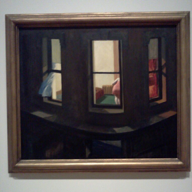
I wrote about Edward Hopper's Night Windows (1928) in my grad school thesis paper. As I looked at it, I remembered that my thesis advisor told me she learned to paint by looking. And it's really true. If you spend enough time with a painting you really can suss out how it was put together, using which colors and in what order. 


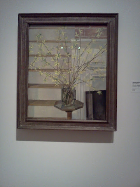
I also saw this great still life, Spring Interior (1927) by Charles Scheeler. I always see the same few Sheeler paintings in books and at the Art Institute of Chicago. I was never crazy about his work, but when I saw this painting, it felt totally fresh and different to me. Each branch is just exactly where it needs to be. It is the kind of painting that I would point to as an example of how sometimes composition can feel like perfection. I can't say why, but when it's good you just know it. I get so excited when an artist I thought I knew (and didn't really care about) does something that surprises me and I love it and then it all makes sense. 


Tuesday, August 14, 2012

How the Art World's Lingo of Exclusivity Took Root, Branched Out, And Then Rotted From Within


A great article about art speak from artinfo: 


The hypnotizing argot of the art world is familiar to anyone who has ever tried to decipher a gallery press release or encountered a nebulous artist statement. It’s a vocabulary of modified adjectives and abstract nouns, of concepts that get deconstructed and ideas that get interrogated, distributed practices and embraced ambiguity. In a recent article for the innovative web publication Triple Canopy, Alix Rule and David Levine coin the term “International Art English” (shorthanded “IAE,” roughly equivalent to the popular nickname “artspeak”) to describe this language, tracing its history and divining its murky rules. IAE “always recommends using more rather than fewer words,” the authors write; it “sounds like inexpertly translated French;” is marked by an “uncanny stillness;” and has a heavy “dependence on lists” (guilty as charged).
Rule and Levine have arrived at their findings by sorting through the past 13 years of press releases from e-flux, an online art project and distribution platform founded by artists Anton Vidokle, Julieta Aranda, Adriana Arenas, Josh Welber, and Terence Gower in 1999 that sends out paid-for announcements to its 90,000-plus-member email list. Rule and Levine loaded the collected press releases into Sketch Engine, a piece of software that analyzes linguistic behavior and trends from bodies of text. The tendencies that they discovered are obvious in retrospect — an overreliance on adverbs, repetition of adjectives, and a preponderance of subordinate clauses — but more striking is their outlining of the past and possible future of IAE....
Within the art world, International Art English is everywhere at once; it’s the air we breathe, a medium for communication rather than the content of communication. What was once elite is devalued, a process that has coincided with the growth and gradual mainstreaming of contemporary art that continues in the 21st century. Similarly, but in a broader sense, the action of curating is now devalued to the point of meaninglessness, where to curate simply means to exist, or to select, as any competitive animal has always done, one thing above another, slightly worse thing. The curator is dead, victim to omnipresence. Long live the curator.
Read the rest here:


http://www.artinfo.com/news/story/817400/how-the-art-worlds-lingo-of-exclusivity-took-root-branched-out-and-then-rotted-from-within


Thursday, July 12, 2012

A great article on the state of painting


From: http://henrimag.com/blog1/?p=5936


Our age is retrospective. It builds the sepulchres of the fathers. It writes biographies, histories, and criticism. The foregoing generations beheld God and nature face to face; we, through their eyes. Why should not we also enjoy an original relation to the universe? Why should not we have a poetry and philosophy of insight and not of tradition, and a religion by revelation to us, and not the history of theirs? Embosomed for a season in nature, whose floods of life stream around and through us, and invite us by the powers they supply, to action proportioned to nature, why should we grope among the dry bones of the past, or put the living generation into masquerade out of its faded wardrobe? The sun shines to-day also. There is more wool and flax in the fields. There are new lands, new men, new thoughts. Let us demand our own works and laws and worship. Ralph Waldo Emerson Nature
Back to the Future
Emerson wrote this lament about America and Americans in the 1830s, and it seems, even at that early date in our history we had become nostalgic for an imagined arcadia. We Americans enjoy, engage and covet the blissful comforts of nostalgic revery – from the orderly certitude of manicured lawns and white picket fences all the way to the ironic discomforts of Andy Warhol’s two-toned wig. We are in love with our own mythologies, crave the retelling and representations of our origins. And in our Postmodern Age that kind of nostalgia runs rampant in our culture. We have come to accept and expect it’s presence in nearly everything we engage with, especially in painting. And the current end of gallery season summer extravaganzas offer hardly any surprises in this regard.
Right now you can walk into any number of studios of abstract painters in New York City and see contemporary “advanced painting” that looks and acts very much like this 1927 Painting by Miro:


Thursday, June 07, 2012

Mairead O'hEocha

Garden, Duncormick, Co.Wexford
Oil on board
49 x 63 cm
2011


Thursday, May 10, 2012

Greta Waller


Greta Waller
My Rejection Letter, 2008
oil/linen
18 x 24 inches

This is just great. Why didn't I think of painting this?

Tuesday, March 27, 2012

Violet Baxter

Signs, 2008, Oil on Panel, 12 x 12 in.


Nightlights I, Oil on Panel, 14 x 11 in.


Watertower Still Life, 2009, Oil on Panel, 16 x 20 in.


Monday, March 26, 2012

Byron Thomas


Pine Trees, 1946, oil on canvas, 40" x 28" in.

Paintings I would like to see in person:


"Tear Gas and Water Hoses," Edward Biberman,1945.


"Movies-Canton Island,"
Paul Sample, 1943.


"Night Hauling," Andrew Wyeth, 1944.

Friday, March 23, 2012

Harry Leith-Ross


Gloucester Wharf, 1935


Flag Station, 1945


Saturday, March 03, 2012

Wish I had seen this show: George Ault


To Make a World: George Ault and 1940s America, was at the Smithsonian American Art Museum from March 11 – September 5, 2011.

To Make a World captures a 1940s America that was rendered fragile by the Great Depression and made anxious by a global conflict. Although much has been written about the glorious triumph of the Second World War, what has dimmed over time are memories of the anxious tenor of life on the home front, when the country was far distant from the battlefields and yet profoundly at risk. The exhibition brings viewers back into the world of the 1940s, drawing them in through the least likely of places and spaces: not grand actions, not cataclysmic events, not epoch-making personalities, posters, and headlines, but silent regions where some mystery seems always on the verge of being disclosed.


Friday, March 02, 2012

Fabulous quote from Peter Schjeldahl


In this week's New Yorker, Peter Schjeldahl reviews a Cindy Sherman retrospective at the Museum of Modern Art. He also puts into words something that I have been struggling with for years-- the ability of art language and art writing to suck the life out of art. He starts off by quoting the wall text:

"Masquerading as a myriad of characters, Cindy Sherman invents personas and tableaus that examine the construction of identity, the nature of representation, and the artifice of photography." The images do no such thing, of course. They hang on the walls. The pathetic fallacy of attributing conscious actions to art works is a standard dodge, which strategically de-peoples the pursuit of meaning. Such boilerplate language has trailed Sherman since her emergence, more than thirty years ago, in the "Pictures Generation" of media-savvy artists who tweaked conventions of high art and popular culture, sometimes in tandem with theory-bent, iconoclastic academics and critics. The association made for a rich episode in the history of ideas, and a spell of heady distraction in that of art. The intellectual vogue is long over, though the pedantry lingers, presuming that the mysteries of Sherman's art-- photographs that are like one frame movies, which she directs and acts in-- demand special explanation. (She is remarkably tolerant of interviewers who keep asking her what she means, as if, like any true artist, she hadn't already answered in the only way possible for her: in the work.)

The rest of the article is pretty great too.

Favorite art words used this week in spring midterms:

Parallax
Syntax
Relational Aesthetics
Agency
Dichotomy
Ethnographic
Effulgent
Indexical
Synthesis


Favorite art words used last semester:
Emphatic
Solipsistic
Axiom
Hegemony
Shibboleth
Reification
Pedagogy
Reflexive
Praxis
Materiality
Social Practice
Inchoate
Morass


Thursday, March 01, 2012

Kurt Solmssen


There is a great interview with painter Kurt Solmssen on the painting perceptions blog:


He paints outside, from life. His paintings have wonderful, dark shadows and a mix of crisp and loose lines.


Tuesday, February 28, 2012

New Paintings- midterms


This is what I showed at midterms:

Gerhard Nordstrom


Admiring the beautiful paintings of Gerhard Nordstrom today. He's 87 years old and known for his anti-war paintings of the 70's. He is perhaps Sweden's most famous painter. His usually pleasant nature paintings often have dead bodies hidden in them.

Monday, February 20, 2012

Studio and Garden: At the Met: John F. Kensett, Minimalist


Studio and Garden: At the Met: John F. Kensett, Minimalist: Sometimes we are reawakened to an artist's work by seeing it in a new context, which scrubs our eyes clean and opens a space in our mind. This happened to me during my recent visit to the Metropolitan Museum of Art's new American Wing. In a gallery devoted to 19th century landscape painters, one stood out for me in a startling way: John Frederick Kensett. It's as though I saw a completely new painter, one who looked at the world with a sense of its essential nature, and who left the extraneous behind. A painting: sea and sky, the light of sunset gently touching the waves, the only diagonals barely traced in the upper sky. A painting full of light, but not drama; an everyday glory.


Eaton's Neck, Long Island, 1872; oil on canvas, 18 x 36 in.


A curve of beach and hillock sweep into the space of sky and sea, each element in perfect balance.


Eaton's Neck, detail


Kensett's touch is restrained yet visible, alive in its descriptive power.


Twilight on the Sound, Darien Connecticut, 1872; oil on canvas, 11 1/2 x 24 1/2 in.


Another still sunset, with elements separated by treed masses, a human trace in the floating boat.


Passing Off of the Storm, 1872; oil on canvas, 11 3/8 x 24 1/2 in.


This painting is a marvel of light and air. Clouds are reflected in water of nearly the same hue, yet each is itself: the water transparent and reflective, the clouds indefinite masses. Three simple rectangles make up the composition: water, dark clouds, and the bright band above them.


Passing Off of the Storm, detail.


Small details of boats, a fisherman, a bird taking flight, are added with quick strokes of the brush; they seem to hardly be there at all, just brief touches on the landscape.


A Foggy Sky, 1872; oil on canvas, 30 1/2 x 45 3/4 in.


Salt Meadow in October, 1872; oil on canvas, 18 x 30 in.


I photographed the first four paintings above at the museum, then went to the Met's Kensett website page to see if I could find additional works that fit the feeling I had that day of a painter using minimal means to express a great deal. I found the two paintings above, which are not on view in the galleries, but in the study collection, so I will try to see them on my next trip. In preparation for writing this post, I pulled my Kensett book, John Frederick Kensett: An American Master, from my studio bookshelf. It wasn't until then that I realized that all the work I'd been so drawn to were part of what is known as Kensett's "Last Summer's Work", a group of 39 paintings that he completed during a three month period in 1872, mainly around his Darien, Connecticut studio on Contentment Island, an amazing achievement. Tragically, Kensett died a few months later, and in 1874 his brother gave this group of paintings to the Metropolitan Museum, many of which are still in the museum's collection. I can't help but wonder how his work would have developed if he had lived; would he have continued to be inspired by the spare landscape on the Long Island Sound, and emptied his paintings even more of incident? In his Last Summer's Work, Kensett has left us paintings which are quietly attentive to specifics of light and landscape, and through that very sensitive attention transcends them.