Wednesday, November 27, 2013
Tuesday, November 26, 2013
Vermont Studio Center-- new artists
I met some great artists in Vermont including, Hai Hsin Huang

She does these amazing, detailed drawings with hundreds of tiny figures in laughing, choking, partying, running, drinking, performing CPR, and crying.
One of her earlier paintings. More here: http://haihsinhuang.com/work.html

Andrew Fish makes large bright paintings of vacation-y people and places. Really fantastic use of color and reduced but precise forms.
http://www.wanderingfisheye.com/Home.html
and finally, Veronika Pausova. Strange and wonderful, this one is called Desperate Painting.
This one is called Excorcism II. See more here: http://veronikapausova.com/index.php/project/

She does these amazing, detailed drawings with hundreds of tiny figures in laughing, choking, partying, running, drinking, performing CPR, and crying.
The woman in the bottom right of the picture, leaning forward in her chair, is my favorite. She looks as if she's about to throw up.
One of her earlier paintings. More here: http://haihsinhuang.com/work.html

Andrew Fish makes large bright paintings of vacation-y people and places. Really fantastic use of color and reduced but precise forms.
More here:
http://www.wanderingfisheye.com/Home.html
and finally, Veronika Pausova. Strange and wonderful, this one is called Desperate Painting.
This one is called Excorcism II. See more here: http://veronikapausova.com/index.php/project/
Sunday, November 17, 2013
Saturday, November 09, 2013
Good read-- The Loss of Painting
From Viktor Witkowski of sameoldart.tumblr.com
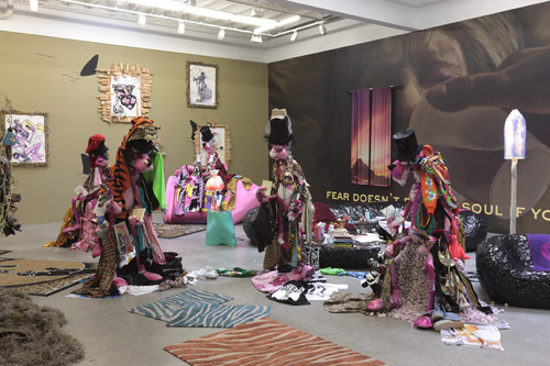
Two days ago Jerry Saltz published an article about the emergence of a phenomenon in contemporary art: “Neo-Mannerism.” Before I continue with his most recent commentary on the state of art in New York City, I want to go back to an earlier essay of his. This past Sunday, Saltz reviewed Bjarne Melgaard’s current show at Gavin Brown’s Enterprise.
Installation shot of Bjarne Melgaard’s exhibition Ignorant Transparencies at Gavin Brown enterprise
In his review, Saltz points to the presence of cliches that persist in art today and argues that Melgaard manages to avoid many of them. He then singles out the “bad-boy installation” - something many male artists emulate, but fail to master. According to Saltz, Melgaard’s work “doesn’t rely on scale, high production cost, obvious symbolism, hipster hieroglyphics, or post-adolescent sexuality. You get the feeling that instead of this being a punkish game of piecing gothlike signifiers together, Melgaard is replicating things less recognizable and not so easily named or snickered at.”
I do not agree with Saltz’s evaluation of Bjarne Melgaard’s work. It is true that we are spared from post-adolescent sexuality. Instead we encounter something more raw and less watered-down. But I wonder if the inclusion of painted and dressed pink panthers functioning as alter egos of Melgaard are not too literal in their attempt to camouflage any obvious meaning and readability. Does Melgaard hope that altered pink panthers will leave gallery visitors flabbergasted, irritated, or amused enough so that they marvel at what they are looking at? Mike Kelley’s stuffed animals are not only more effective in this way, but they are quieter, stranger and creepier.
There is a fine line, but a line nonetheless, between overstating and understating one’s point. I believe that Melgaard has no trouble overstating his work’s elusiveness and nonconformity whenever he can. A tactic that could potentially be confusing and thereby liberating (because the viewer has to fill in the gaps), becomes a cliche. I am not sure that I can follow Saltz’s arguments that distinguish Melgaard from other bad-boy installation artists (or bad-girl installations for that matter). Saltz’ differentiation appears to be an arbitrary choice rather than a critical position.
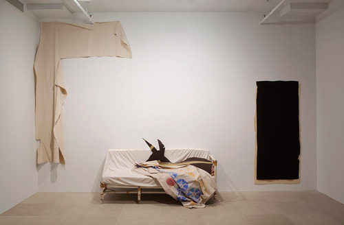
Gedi Sibony, Who Attracts All That is Named, 2010
But there is something very important and true in Saltz’s review of Melgaard’s work. Saltz praises the absence of hipster hieroglyphics and the importance of rendering things less recognizable so that they cannot be easily named. A similar sentiment can be found in his essay on “Neo-Mannerism.” I haven’t read the readers’ commentaries that can be found at the bottom of his article. I am sure that a fair amount of people will be challenging his choice of the term “Neo-Mannerism.” Any attempt to capture and describe a tendency within art with an -ism, will only be partly satisfactory. But that is also not the point here. Saltz’s -ism only works as a contextual framework to give us an idea of how he evaluates this current pattern in art. All he is saying is that a large portion of contemporary art repeats and mimics itself and that it looks alike. On this point, I would concur (hence the name of my blog).
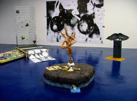
Installation shot of Helen Martin’s FATSO from 2008
I started this blog about two years ago with the intention of focusing mostly on painting and two-dimensional work. I should be offended that Saltz is seriously considering the death of painting yet again. But I am not. The current mannerisms in painting are undermining its potential and strength. One of the biggest problems for a younger generation of painters is that they do not seem capable of ridding themselves of references. By references, I do not mean subtle reconfigurations or appropriations. I mean pop-references, 80s references, Magritte (who seems to be having a big moment right now), 70s cartoons, spray paint, phrases and entire sentences that appear on canvases and photographs, Matisse, 1910s Expressionism (I think that Neo-Mannerism in painting is really Neo-Expressionism), Baldessari photo-collage/-assemblage, Immendorf, Baselitz, and yes: Albert Oehlen is on that list too.
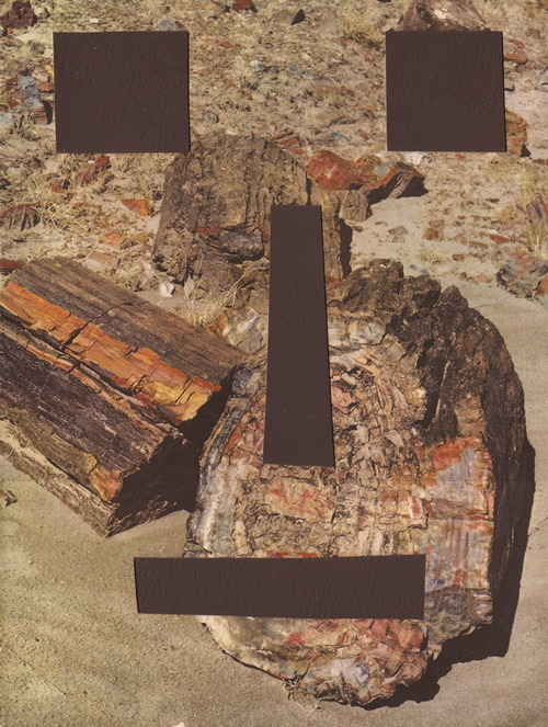
Brion Nuda Rosch, Old Rock Face, acrylic on book paper on found book page, 2010
To include and work with these references is not necessarily bad. It is good to be constantly looking for ideas and to draw from the most unlikely sources. What makes these references bad is how they are being employed. If they are predominantly used for their visual properties, they become a measure of the artist’s aesthetic sophistication. The only issue is that this sophistication is mimicked (as evident in the examples of various works that I included here) and not acquired or developed. In other words, if you include these references in a similar fashion as other contemporary artists do, you do not have to carve out your own niche. You end up doing half the work. That way, you also demonstrate your cultural knowledge of which sensibilities are currently in demand and which are not. The downside is that very few painters dare to explore beyond these parameters. It is safer to do a personal twist on something that is already in place than to enter new territory. The same can be said for the numerous galleries that represent and showcase these artists.
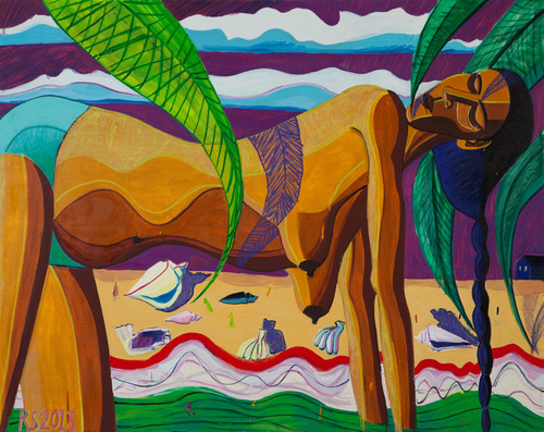
Ryan Schneider, Receiver of Nights, 48” x 60”, oil on canvas, 2013
To come back to Jerry Saltz’s Melgaard essay, the greatest loss in contemporary painting is that of objects that cannot be easily named. References that appear in paintings are usually all too obvious, even bordering the pedantic. Often they are aimed at a particular audience who consists of fellow artists who think and work in similar ways. This idea of schools of thought and schools of style is an old-fashioned one and should no longer be possible.
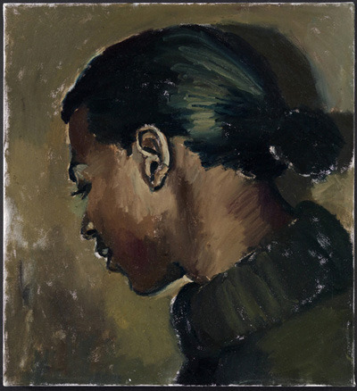
Lynette Yiadom-Boakye, To Tell Them Where It’s Got To, 60cm x 55cm, 2013
An extraordinary exception are the paintings of Lynette Yiadom-Boakye. Fairly traditional in her handling of paint and the representation of human figures, Yiadom-Boakye reveals some of her references (a mix of Velasquez, Manet, James Ensor and occasionally George Condo), but always manages to deliver paintings that stand on their own.
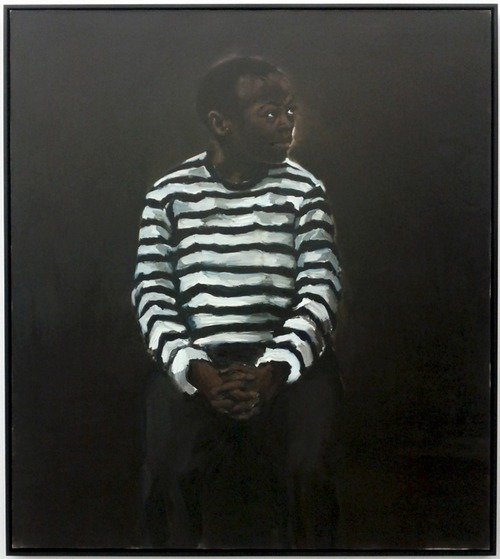
Lynette Yiadom-Boakye, 11 pm Friday, 84” x 72”, oil on canvas, 2008
The fact that her sitters are imagined - and not observed - is just enough to turn the set of employed painterly conventions on their head. Yiadom-Boakye’s subjects have fallen out of time and yet they are timely as they exist alongside ourselves. Nothing is named, all is withheld in the dark areas of her paintings, the heads turned to their side resisting our glances. Then, on other occasions, Yiadom-Boakye’s figures return our stares, but they remain wordless, soundless, still, fixed in undefined spaces as if to welcome our projections, questions, desires and fears.
Her work is not about pledging alliance to a painterly style or fashion. Yiadom-Boakye is committed to painting alone and what it is capable of doing if left alone and entrusted with its most powerful of tools: not to affirm a point of view, but to question it.
Friday, November 08, 2013
Vermont Studio Center
Contemporary Romance
I've curated a new show, Contemporary Romance, at Frogman Gallery, my pop-up space at 23 E. Madison. It is a beauty. The show will have gallery hours Wednesday through Friday from noon to 6pm until the show closes November 29th. You can see more pictures at Frogman Gallery.org Here are some pictures from the install:

And thank you Tyler for your beautiful writing:
You won’t find romance in an artist statement. But you might find it wandering the walls of Frogman Gallery. Simone Chagoya, Amanda Brown, and Stephanie Del Carpio offer their work as examples of art freed from the shabby conceptual frameworks that imperil both artist and viewer alike. Rather than provide a space for shocking political statements or hermetic swaths of postmodern abstraction, their work highlights the simple pleasures of urban isolation. Like the early 19th century Romantics, Chagoya, Brown, and Del Carpio suggest that loneliness is a necessary—and increasingly endangered—part of daily life.
Simone Chagoya’s paintings are immediately charming. Her paintings feature bodiless clothes floating on blank backgrounds splayed out like preserved butterflies offering themselves for inspection. Sugary whites and lacy blacks greet the viewer like frosting on a cake. Chagoya invites viewers to populate the vacant clothing with their own stories and memories, urging us to find beauty and dignity in a humble pair of underpants.
Amanda Brown’s paintings chronicle the unpeopled urban landscapes that can yield moments of sublime loneliness. Morning on Paulina shows a winter street scene dominated by a barren tree whose shadow appears like cracks upon the façade of an unwelcoming building. It’s a building you might stare at every morning while waiting for the bus without even realizing it. Paulina Sideyard and Shell on York find claustrophobic parallel lines juxtaposed with small patches of organic forms—tiny moments of public solitude that let the mind wander.
The first thing you notice when looking at Del Carpio’s paintings is that she renders the eyes of her subjects warmly and with care. Self-Portrait with Braid shows the artist expressionless and staring away from the viewer with her head slightly tilted as if in deep contemplation. The artist is alone with herself reminding us of the necessary solitude of artistic production. In Devon with Masks the subject stares directly at the viewer while standing next to a shelf bearing drama masks. These are the thoughtful women and men who people the desolate urban landscapes of Amanda Brown and the modest clothing of Simone Chagoya. We can’t know what they’re thinking or feeling, but the masks lay there daring us to try.
--Tyler Jagel
Wicker Park Mural-- October 2013
My pal Kent and I did a mural for the Wicker Park Chamber of Commerce. Here's a picture of it:

It is eight feet by sixteen feet on four sheets of marine grade plywood. This should stand up to Chicago winters pretty well. First, we primed the plywood with a couple of coats of Killz Primer.
We used a projector to trace the image (in my darkened garage) and then filled it in paint-by-numbers style.
It got pretty confusing at times.


It is eight feet by sixteen feet on four sheets of marine grade plywood. This should stand up to Chicago winters pretty well. First, we primed the plywood with a couple of coats of Killz Primer.
We used a projector to trace the image (in my darkened garage) and then filled it in paint-by-numbers style.
We painted with six shades of exterior grade house paint. Our painting "map"
It got pretty confusing at times.

Finally, we sealed the mural with four coats of water based spar varnish and then an anti-graffiti sacrificial coat. My pa helped us mount the four sheets of plywood to a brick wall with Tapcon concrete screws and a hammer drill.
Friday, November 01, 2013
Some great art writing from Dion Kliner on Darcy Mann
Read the original here:
http://dkliner.blogspot.com/2013/10/darcy-mann-into-forest_5039.html
http://dkliner.blogspot.com/2013/10/darcy-mann-into-forest_5039.html
Darcy Mann: Into the Forest
Subscribe to:
Comments (Atom)


