Sunday, April 17, 2016

Interview with Eleanor Ray

My interview with painter, Eleanor Ray is on Figure/Ground: figureground.org/a-conversation-with-eleanor-ray/
Also on Painter's Table: painters-table.com/link/figureground-communication/conversation-eleanor-ray
Eleanor Ray is one of my favorite painters working today. 


Eleanor Ray is a painter living and working in Brooklyn, New York. She has an MFA from the New York Studio School and a BA from Amherst College. Her work has been shown in three solo exhibitions at Steven Harvey Fine Art Projects, NY, and in recent group exhibitions at the College of William and Mary, Williamsburg, VA; The Center for Contemporary Art, Bedminster, NJ; Rothschild Fine Art, Tel Aviv; the American Academy of Arts and Letters, New York; Interstate Projects, Brooklyn; and BRIC House, Brooklyn. Her awards include a NYFA Fellowship in painting, residency fellowships at the BAU Institute in France and the Dumfries House in Scotland, and an American Academy of Arts and Letters Purchase Award.
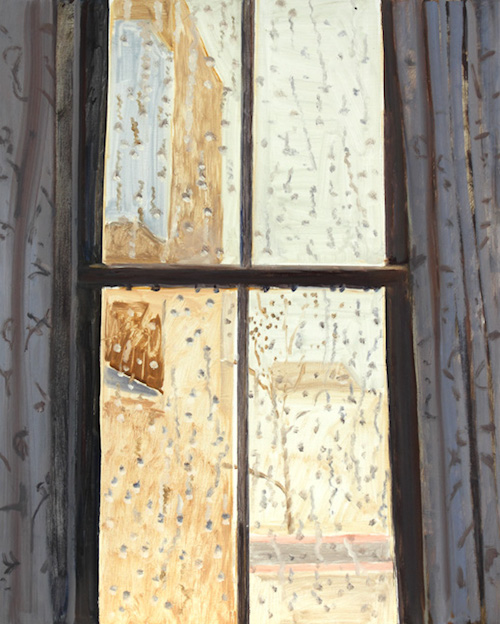
You often have a window or a doorway in your work, which is part of a tradition in painting. Sabine Rewald wrote that the window is a motif that has been used by nineteenth century Romantic painters to represent unfulfilled longing by showing us the very close and the far away. Painting often acts like a window, but in your work, the windows act in the painting to make it seem bigger. Your paintings are tiny, maybe six inches by eight inches on average, but that window creates a larger mental space. Can you expand on that?
I like the idea that the small painting is kind of monumental rather than miniature – that it can contain a bigger space, like the imaginative space of a book, and that you can get back from a smaller painting more easily. So you can see more quickly how it operates on an abstract level when you’re not quite reading the imagery.
Of course many painters have been drawn to the image of windows because of their natural relationship to paintings themselves, with the framing of an organized, distinct visual field. But the relationship there isn’t quite fixed. It’s shifting. That can be especially interesting to see in places where painted space is competing with or surrounding a window, or maybe the real window serves as the light source in the painting, as in Leonardo’s ‘Last Supper’. Or where a painting and a window live side by side, as if offering two options, as in the monk’s cells at the San Marco Monastery in Florence. Each cell there has one painting and one window, on the same wall, and the shape of the fresco mimics the shape of the window. The window is actually recessed from the wall, making the larger and closer painting appear to come forward into real space. Different relationships like that emerge when you see a single rectangular Donald Judd work surrounded on two sides by large-scale windows in his Spring Street building. I’m not deliberately thinking of the window as a representation of one thing; I don’t think it’s so definite. It’s something we live with, an organizing principle like the calendar. The window is always there as part of our visual experience, unless perhaps you lived outdoors.
© Eleanor Ray Mercer Street, 2015, oil on panel, 6 1/2 x 7 3/4 in
© Eleanor Ray Mercer Street, 2015, oil on panel, 6 1/2 x 7 3/4 in
I’ve seen your work mostly on the internet. When I look at your work on the 13inch screen of my computer, I am looking at an image of your work in real size. What I love about your work is that it is perfectly formatted to viewing on a computer, to being seen in the 21st century. I can see all the marks and brushstrokes that would be visible in person and I can see all of it at once. Working out of your apartment in Brooklyn, from many images you have collected, there is something that makes sense about the efficiency and scale of these paintings. I noticed most of your paintings at Steven Harvey Fine Art Projects sold. Your work is scaled to being made and sold in dense, urban settings. Those Romantic painters who made tiny en plein air paintings of Italy glorified nature. I can’t help but think that yourwork glorifies urban spaces and modernity, yet values the importance of real, in-person experience.
It’s nice that images are so accessible online. But having the work seen in person is very important to me. Images seen on a screen tend to exist without any particular scale, and people might actually imagine that the painting is much bigger than it is. I remember myself being surprised many times to see how small a painting, with which I had been familiar only in reproduction, was in reality. I was surprised at first by how relatively small Morandi’s paintings were and Vermeer’s. Piero’s ‘Flagellation’ was also a surprise.
I definitely have a love for urban spaces, but I’m not really interested in glorifying them. I don’t think they need to be.
© Eleanor Ray Ground Floor, 101 Spring Street, 2015 oil on panel, 6 x 8 in
                                                                          © Eleanor Ray Ground Floor, 101 Spring Street, 2015 oil on panel, 6 x 8 in
There aren’t a lot of hard lines in your work. When two things meet it’s a soft line. I don’t know how to describe it. It’s a soft atmospheric line that you couldn’t do in a larger painting, like a shuffling of cards.
Having a soft meeting of colors feels more tactile and spatial to me; you can imagine feeling around the edges that way, rather than making a sharp line that kills the space. I’m not consciously thinking about how to do that while I work though. It’s more intuitive.
FG SanMarcoStairs
                                                                                 © Eleanor Ray San Marco Stairs, 2014 oil on panel, 6 x 5 1/2 in
It’s such a grad school idea to make a huge work. For a lot of students it’s the first time they’ve had access to that much space. They have to make something big because they feel they are never going to have that much space again.
Yeah, I did get some crap from classmates about that. Make it bigger! But my studio in grad school was smaller than the one I have now. It was called the Guston Kitchen — apparently it was part of Philip Guston’s apartment when he stayed at the Studio School as a visiting artist. It was a narrow space with lots of cabinets and not much free wall space. Maybe it was nice in a way that it gave me permission to work smaller. At the Studio School we’d been encouraged to do a lot of really large painting. It felt like a part of the culture there. But I wanted to keep moving rather than work on one large painting for a long time. When you’re making small paintings, you can keep trying out more images and get more momentum. And something about the size of the mark in relation to the image on the smaller scale started to click for me. Still, it’s sort of mysterious what scale works for different people, and maybe you have to stumble onto it.
Is your work a reaction to the big painting? Is it the more mature, next step?
There are good reasons to work big too, of course, but I don’t think big has to be the default scale for serious painting.
FG AtelierCezanne
                                                                        © Eleanor Ray Atelier Cézanne, Aix, 2015 oil on panel, 5 1/4 x 5 3/4 in
How do you choose an image? Do you do sketches at the site or do you take photos or work from memory?
I do all of those things. I take pictures and make drawings. What to paint and what to keep involves a slow editing process that happens over time. The images usually come from specific experiences with places, from what’s been memorable or moving for me. Like the experience of first seeing certain artworks: when something can surprise you although you did not expect to be too engaged with it, or when what seems at first like a disappointing aspect of a place can actually become more interesting. Painting is a way to look more closely at those things – to bring different places or subjects into contact with each other in the context of a group of paintings, without those relationships having to be too overly determined. But choosing an image is a mysterious process, like scale… I like what Anne Truitt described as recognizing her own experience, finding external equivalents for her intuitions.
FG VilladiLiviaII
© Eleanor Ray Villa di Livia II, 2015 oil on panel, 6 x 4 in
I can’t pinpoint an Eleanor Ray formula, but when I see a painting I know it’s yours.
That’s good to hear.
You have a painting of Cezanne’s studio with a ladder casting a shadow, which is also reflected in a mirror. It’s like a copy of a copy of a copy contained in a painting. I need to look at it to search for the origin. Where is the source? There is no real ladder, at least not in this painting. The way you mix colour is so particular and precise. That is maybe why they are small, because that is the limit of how focused a maker could be while holding all the variables together at once. The size of the brush, the direction of the mark, the colour choice, everything is carefully considered, and you seem to be aware of everything during every single moment of construction. If they were bigger, you’d get tired and lose focus. There would be moments you were paying more attention to the podcast you’re listening to or just filling in space.
That’s how I used to feel making larger paintings – I had to cover the surface. Some people must get a lot of pleasure out of that physical gesture of filling a big expanse. But for me that wasn’t it.
FG SquashCourt
                                                                       © Eleanor Ray Squash Court II, 2015 oil on panel, 6 3/4 x 9 in
How long do you work on a painting?
Most of them are done in one sitting of three or four hours, but not as a rule. Sometimes I do go back and rework paintings and I often make second and third attempts at the same idea or image.
Do you draw it out in pencil on the masonite surface?
I usually draw a little bit before I start painting.
That’s what I’ve found out about painting, that I can only do it for three or four hours at most at a time before I lose focus.
It’s important for me to have other kinds of work that I do around the painting. To read, look at other art and go see shows, and just get out of the studio. I don’t believe you have to work any certain number of hours.
Do you have other jobs aside from painting?
No, only painting right now. It’s really luxurious.
It’s clear from just looking around your apartment at the number of books that you have and your subject matter that you know painting and its history well.
Art history is so accessible. You don’t have to study Latin to look at ancient Roman paintings. I love that. It’s a great luxury for painters that they can look at a recorded history for so much longer than artists in literature or music.
FG MatisseChapel
© Eleanor Ray Matisse Chapel, Venice, 2015 oil on panel, 6 1/4 x 7 in
How did you end up painting on panel?
I started painting more on panel around the same time I started painting smaller. I like the way the paint sits on the surface and stays where you put it. I’m working on a machine-sanded surface so there’s no grain. I get panels cut to a variety of specific dimensions because I want a lot of choice. I end up with a stack of panels and I choose a size for the particular image, or maybe the reverse. Maybe that introduces a little randomness. If I favor a certain dimension more for a while, say I use up all the squarish ones, then I’m left with some odder shapes and I end up having to use them. I don’t want to use the same dimensions over and over right now.
 Who do you look to? Who are your favourite painters, living or dead?
Seeing the Morandi and Bonnard shows at the Met in 2008 and 2009 made a big impression on me. That was such a great pair of shows to see back-to-back and in the same space — two painters taking ordinary imagery to such different extremes, and both clearly in love with painting in different ways. And then I’ve always loved Vermeer and Matisse as well as Giotto, Duccio, Piero, Gwen John, James Castle, ancient wall paintings. I love Giorgione’s ‘Tempest’, and Piero’s pregnant Madonna, painted in his mother’s home town. I like the way Guston put it, that ‘the art of the past is a hidden art’. I think partly he meant that in a Piero fresco, say, the abstraction is masked by the imagery, and therefore revealed more slowly than in a Mondrian. But older art can also seem unavailable to us when we know we’re missing so many period associations, or the meanings of the iconography. But maybe, depending on your temperament, that problem can also make things more interesting. To me those things are almost red herrings, and everything there is actually visible — Giotto feels so straightforward in a way. It’s a grand narrative that still feels down to earth. To see things like that in person where they were made can be so raw. Giotto in Padua and Masaccio in Florence were especially powerful that way.
That seems like the perspective one has as an adult. You couldn’t see those things when you were younger and looking at a book.
 More recent art helps you see those things too. You see things going backwards almost through what’s closer to your own time. But it goes both ways, of course. Now Vermeer’s interiors feel like Annunciations to me: a woman receiving a letter or waiting for news. Or, you can see Matisse in the black outline that comes and goes around Empress Theodora’s attendants in a 6th-century Byzantine mosaic. Also, I understood Morandi’s colors differently after seeing Italian fresco paintings. So, in painting everything is so visible in one way, but then it’s not communicating something reducible or definitive. A painting is both fixed, seen in an instant, and always shifting, open to being reseen.
Those are beautiful ideas, that as you put it, ‘everything there is actually visible’ and that seeing goes both ways. That, to me, is the crux of what your paintings do.

Wednesday, March 23, 2016

How Critical Thinking Sabotages Painting

I saw this on Facebook today. Terry Myers (the painting department chair at the School of the Art Institute of Chicago) shared Laurie Fendrich's essay, How Critical Thinking Sabotages Painting. I feel like I have been screaming a less eloquent version of this essay into a dark void for the past ten years. I want this entire essay engraved on my tombstone someday. Thank you Terry for posting and thank you Laurie for doing the hard work of cogently expressing these thoughts.


Terry R Myers
Peter Plagens has posted Laurie Fendrich's essay in the Chronicle of Higher Education. Food for thought, to say the least:
How Critical Thinking Sabotages Painting
Painting requires different abilities from articulating what one’s art is about.
By LAURIE FENDRICH
Painting is a medium in which the mind can actualize itself; it is a medium of thought. Thus painting, like music, tends to become its own content.
— Robert Motherwell
During the two and a half decades I was a full-time painting professor before retiring in 2014, followed by the year and a half I spent as a visiting artist at two prominent art schools, I observed dramatic shifts in ideas about teaching painting. Professors of my ilk see painting as a hands-on art form best learned through looking at great paintings and at painters in action, and by painting while being coached. The new pedagogy has been endorsed mostly by younger painting professors but a few geezers too, who see painting as best learned through critical thinking, a method borrowed from literature and the social sciences.
“Skillfully analyzing, assessing, and reconstructing” a subject, “critical thinking is self-directed, self-disciplined, self-monitored, and self-corrective thinking.” So says the Critical Thinking Community. The approach benefits disciplines based in words, and I use it myself when teaching modern art history and humanities seminars. But it’s a disaster when used to teach painting, whether to college art majors who want to become painters, to students who want to go into neighboring fields like graphic design or photography, or to biology students who decide to give painting a try.
Applied to painting, critical thinking too often ends up calling into question the very medium—a deconstructionist impulse that particularly sabotages beginning students. Playing baseball or tennis requires accepting the game as a whole, and so does painting. But unlike baseball or tennis, painting is an open-ended pursuit without any numerical victory or defeat. It’s fraught with subjectivity and uncertainty. It is, as an artist I know has said, one semi-mistaken brushstroke after another applied until a kind of truce against the possibility of a perfect painting is reached.
Painting is particularly ill-suited to the critical thinking that has become ubiquitous on college syllabi and de facto mandated by outcomes-assessment mavens who demand that all professors, even art professors, articulate “desired outcomes” from specific “goals and objectives.” Nonetheless, given the corporatization, bureaucratization, quantification, and discrediting of subjectivity and taste in higher education, it has been able to establish first a foothold, then a beachhead, and ultimately a colony in that most unlikely of places, the college painting classroom.
By sidestepping its subject, critical thinking inadvertently bolsters the old idea, around since Plato but not in full flower until the Romantic era starting in the 18th century, that art can’t be taught. In a cloudy, anti-pedagogical way, it’s true: The spark of inspiration and creativity involved in making art is mostly beyond the reach of teachable knowledge, unless you give credence to those airport-bookstore self-help books and online you-can-be-an-artist boondoggles. Equally true, however, is that this idea has had an insidious effect on art students and professors because — on the ground, as they say — it’s an invitation for professors to stop teaching and students to stop learning.
With today’s identity-conscious students wanting, right off the bat, to express in paint ideas about anything from gender crossing to wealth inequality to global political oppression, competence in painting’s traditional skills has become almost a no-go zone. Painting professors have retreated to merely “supporting” and “nurturing” student painters, asking only that students “articulate” what they’re trying to do — that is, to retroactively apply critical thinking to their works. As a result, a lot of students leave painting courses prematurely feeling good about themselves because they’re able to talk some pretty good contemporary smack about art. But few have learned much about painting.
In the fall, I had some extended conversations with the renowned California painter Wayne Thiebaud. A professor of painting at the University of California at Davis for almost 40 years, and after that perhaps the world’s most famous art adjunct faculty member for another 16, Thiebaud is a spry 95-year-old who spends most days in his studio and plays a lunchtime hour of tennis every day. He rose to national prominence in the early 1960s with his thick, cheery paintings of lusciously colored candies, pastries, and cakes. For a while, he was considered one of the original Pop artists, along with Andy Warhol, Roy Lichtenstein, and Claes Oldenberg. He moved on, however, to paintings of exaggeratedly steep San Francisco streets, landscapes of the flat midriff of California (where, save for a brief stint in New York, he’s lived most of his life), and lonely human figures.
Thiebaud has the kind of talent and bravura that lets him teach by painting his assignments as continuing demonstration, alongside his students. In that, he’s a rarity.
“Painters don’t really want to paint in front of anyone,” he says. “They prefer to make their mistakes without anyone watching. But this is a great way to show students how the act of painting is done by a living painter — as opposed to Titian, who isn’t here.” From his friend, the abstract expressionist painter Willem de Kooning, Thiebaud learned that painting is “a process of starting over at every stage.” Painting offers, in other words, constant and multiple paths to success (and failure). Thiebaud’s love of tennis might come from a similar virtue: The game (like baseball, but unlike football) promises a chance of victory right up to the very end.
Thiebaud believes the two most important things a painting instructor must teach are how to render a three-dimensional object convincingly on a flat surface and how the painter’s combinations of color create the sense of light. Practice-centered teachers like me, though we vary widely in our methods, essentially agree. We introduce students to painting through fundamentals — basic color theory, the behavior of pigment color, principles of composition, ways to make paintings appear flat versus ways to create three-dimensional illusions, paint handling, a little chemistry, and a few art-historical examples of artists (Édouard Manet, George Bellows, Alice Neel, Helen Frankenthaler) who handled paint particularly well. As Thiebaud puts it: “To call everything art is an obfuscation for the students and fails to clarify what we’re trying to get at as painters. Painting is concrete, but art is abstract. I don’t think we know what art is. But we know a lot about painting.”
So how did critical thinking get into the mix? Many administrators like the way it makes otherwise incomprehensible images appear rational. There are painting professors who embrace it because they think it gets rid of stodgy, laborious, and boring foundation requirements that crush the souls of young, sensitive students wanting to express themselves. Then there are those who think that 150 years of modern art obviate both the need for, and the possibility of, teaching fundamentals. What kind of ‘fundamentals’ did Marcel Duchamp or Jean Dubuffet or Donald Judd or Joseph Beuys or David Hammonds need? they ask. Others note that since the common list of painters who mastered the fundamentals are derived mostly from a pool of white, European males, requiring painting students to attain a certain competence in them is sexist and racist. Finally, much of the hard painting work that rests on the triad of mind, hand, and paint can be, some au courant professors assume, outsourced to photo-transfer, digital scanning, and ink-jet printing. Since techniques are presumed to be instantly available off the technological shelf, a motto of convenience has taken hold in some art programs: “No technique before need” is the buzz phrase — an attitude that strikes me as a lot like saying there’s no need to learn French until you get to Paris.
Meanwhile, some painting professors enjoy the collapse of any shared convictions that painting has universal or core knowledge. After all, that relieves them of the unpleasant task of making judgments about the quality of student work. Once critical thinking takes over, the focus shifts from visible virtues and flaws in the painting in front of everyone to the student’s putative ideas and noble intentions regarding art and what it can do for the world.
Colleges and art schools have traditionally welcomed students in all majors to sample painting for a semester or so, which is OK as far as it goes. Being a painting professor does carry an obligation not only to mentor art majors but to serve a variety of students taking breadth electives. But for those painting students with a feel for paint and a drive to learn, teaching painting through the lens of critical thinking amounts to lost time. I’ve had a depressing number of students in advanced painting classes tell me that when they look back at their beginning classes suffused in thinking critically about the practice of painting itself, they feel cheated because no one required them to learn anything fundamental about the craft itself. They were asked from the get-go — to use the language of art-school catalogs — to ask bold questions, conduct rigorous social and political investigations, and engage in playful creativity.
Even on the graduate level (I do occasional critiques as a visitor), some poorly trained students lack a basic understanding of how pigment behaves, differently from what color theory predicts. For example, in theory, black added to yellow tamps down the intensity and darkens it, but to the human eye, it produces what appears to be green. They don’t know that oil colors appear darker when applied to the canvas than they appear on the flat palette. They don’t understand the subtle and crucial difference between a color’s intensity — its brightness — and its hue or value. Worse, many painting students at all levels don’t care about these things. They’re willing to accept the sourest, muddiest, most clumsily executed painting if an iconography of personal identity or social critique is crudely visible.
Critical thinking applied to painting also leads to a lot of rhetorical gobbledygook about painting and the way it conveys meaning. Nowhere is this more evident than in the many student artist’s statements (de rigueur in an age of outcomes assessment) I’ve read over the past several years. Most of them are poignantly well-intended but poorly written. Unfortunately, in the face of demands that they be “articulate” about painting — a part of culture that defies totalization in words — lucidity is lost. In trying to puff up their statements into the jargony prose their professors (particularly on thesis committees) will approve, they pepper them with semi-understood terms lifted from postmodern literary theory.
It’s not uncommon for painting professors — few of them trained in Continental philosophy, or any other philosophy, for that matter — to bandy about such words as “identity,” “oppression,” “pictorial discursiveness,” and “ontology.” Gone is the idea that painting is understood only by groping one’s way to imperfect meaning through poetic expressions or universally understood metaphysical ideas. The imaginative writing of, say, the poet and art critic Frank O’Hara or the aesthetics-focused philosophizing of the painter and scholar Robert Motherwell would be nearly incomprehensible to today’s painting students, many of whom have grown used to hearing painting talked about as if it were the subject of a sociology dissertation.
The art world sets an unfortunate standard in this unreadable stuff. For example, here’s an excerpt from the Museum of Modern Art’s press release about its 2015 “Forever Now” exhibition of contemporary abstract painting:
The artists in this exhibition … use the painted surface as a platform, map, or metaphoric screen on which genres intermingle, morph, and collide. Their work represents traditional painting, in the sense that each artist engages painting’s traditions, testing and ultimately reshaping historical strategies like appropriation and bricolage and reframing more metaphysical, high-stakes questions surrounding notions of originality, subjectivity, and spiritual transcendence.
In other words, paintings as everything but painting.
Painting contains its own roughly defined rules. The art is flat, rectilinear, and smeared with colored pigments. It differs from the many boundaryless arts born in the late 60s and 70s — installation, conceptual, and performance art — where the creators essentially do what they want. A painter can bend painting’s rules only so far before a painting is no longer a painting. Moreover, unlike new genres that only now are building their histories, every painting exists in the long shadow of great paintings from the past.
James Elkins is a professor of art history, theory and criticism at the School of the Art Institute of Chicago and a lively, prolific writer with first-hand knowledge about painting. He has an MFA in painting to go along with his Ph.D. in art history, and explores painting education in his books Why Art Cannot Be Taught: A Handbook for Art Students (University of Illinois Press, 2001) and Art Critiques: A Guide (New Academia Publishing, 2012). I asked him if painting, bounded and defined by its own rules, might be exempt from the Romantic idea that art can’t be taught.
“Probably not,” he said.
In an earlier book, What Painting Is (Routledge: 1999), Elkins describes in detail the particular kind of uncertainty endemic to painting, beginning with the nonrational ways in which painters throughout history have come up with bizarre concoctions out of such things as blood, urine, and horse hooves to make their paints. While modern chemists have developed synthetic substitutes for most traditional natural pigments, in terms of its gooey, messy essence paint hasn’t changed one iota. Elkins makes the case that painters and alchemists alike handle their materials “without knowledge of their properties, by blind experiment,” and mix their substances not by formula, but by feel.
Yet relying on feel isn’t quite the chancy process it might at first seem. Feel is a way for painters to escape clichéd Martha Stewart colors and discover situational new ones among the millions the human eye can perceive. Because modern painting relies so much on the individual artist’s feel, Elkins doesn’t see much place for concrete knowledge of the Thiebaud-esque sort. “It’s no longer clear that painting is something that requires a body of knowledge that can be studied and learned,” he says. “It may be ‘stepless’ — beyond the reach of any routine education.”
According to Elkins, the prescribed “way to make a painting” was abandoned with the Impressionists, and painters became perpetually at risk of “sliding into a wasteland of mottled smudges with no rhyme or reason.” He doesn’t consider this a bad thing. He thinks painting is a perfect match for our “anxious age” and is “the greatest art form for expressing our place between rule and rulelessness.”
That’s all well and good at the top, with paintings created by good, near-great, and great artists. At that level, yes, the celebrated uncertainty of painting, the way every brush stroke tries and partly fails to correct another, may be impossible to teach, only accessible to the talented through observation and experience. But that approach, in my view, obscures the aspects of painting that are certain and that can be taught.
As painting professors become increasingly enamored of critical thinking, or pressured by academic fashion to embrace it, they lose the ability to understand these aspects, and they abandon pursuing the fruits of direct observation in favor of the dubious pleasures of verbal abstraction. Inspired (if that’s the word) by such flaccidly overreaching exhibitions as “Forever Now,” their students come to the fore as the next crop of “emerging artists” who prematurely indulge in deep social and political readings of their own paintings. Professors aren’t being tripped up by the operational uncertainty of painting — that has always been the medium’s magic and its glory as well as its challenge. What’s hindering them is the faux-uncertainty of borrowed critical thinking that stuffs painting into a box of pretentious words.
Well, then, if the craft of painting is hard if not impossible to teach, and if the theory of painting doesn’t help make great or even good painters, then maybe painting doesn’t fit in the modern university at all, you might argue. What good in an academe increasingly dominated by STEM fields and metrics are painting’s subjective, haptic procedures and its holistic approach?
Lots of good. For starters, its vast range of colors — compare it to the limited range offered by the additive colors of the computer screen’s pixels — and its felt composition within a rectangle offer models for understanding alternative ways to organize what happens on computer screens and smartphones.
More important, with its openness to incorporating chance and accident, and its continual internal morphing as it grows, painting offers a direct demonstration of how innovation can come from within a physically prosaic and limited enterprise. Painting professors and students should abandon the windbaggery of academic critical thinking and remember that, while there may not be any bedrock fundamentals in art, there are plenty of fundamentals in painting. And if now and then they take time to notice when it is stirring, beautiful, and exhilarating — well, no harm done.
Laurie Fendrich is a painter, writer, and professor emerita of fine arts at Hofstra University.

Monday, March 14, 2016

Paintings I've been looking at lately


Alice Neel. James Hunter Black Draftee, 1965. Oil on canvas.

Frank Auerbach, Head of J.Y.M II, 1984-85

Mikhail Ivanovich Glinka during the composition of the opera by Ilya Repin, 1886

This crazy one painting show by Thomas Eggerer at Friedrich Petzel (New York)


(detail)


Margot Bergman

Kyle Staver

Sunday, March 13, 2016

John Yau on Lois Dodd (via Hyperallergic)


This article is a breath of fresh air. Thank you, John Yau.

And check out more catalog images here:
https://static1.squarespace.com/static/51e5921ee4b0c6df9a7cb5df/t/56c5dc33c6fc08a571e8df95/1455807541743/Alexandre+Dodd+2016+e+spreads.pdf

So Much Depends…


Lois Dodd, “Second Street Crabapple Tree” (2015), oil on masonite, 15 x 15 1/2 inches (all images © Lois Dodd, courtesy Alexandre Gallery, New York)
About William Carlos Williams’s most anthologized poem, “The Red Wheelbarrow,” Robert Penn Warren and Cleanth Brooks said in their book, Understanding Poetry:
[…] reading this poem is like peering at an ordinary object through a pin prick in a piece of cardboard. The fact that the tiny hole arbitrarily frames the object endows it with an exciting freshness that seems to hover on the verge of revelation.
Had Warren and Brooks known of Lois Dodd’s paintings, I imagine they would have arrived at a similar conclusion, though I am inclined to think they would have revised the phrase, “arbitrarily frames the object.” That’s because there is nothing arbitrary about the way Dodd discovers her subject — the fusion of viewpoint and familiar object — in the routines of her everyday life. By framing these objects — a window, a clothesline, a cherry tree — in changing seasons and times of day, she finds ways to see her life anew, to celebrate the commonplace, while astutely probing the pressures modernism has placed on the picture plane.

Lois Dodd, “15 Night Windows” (2016), oil on masonite, 18 1/2 x 10 1/2 inches (click to enlarge)
In 1952, Lois Dodd, along with four other artists, started the Tanager Gallery on East Fourth Street, near the Bowery, one of the first artist-run cooperative galleries in New York. A year later the gallery moved into a larger space on Tenth Street, where it continued to operate until 1962. Dodd has been exhibiting for more than sixty years and, if her current show, Lois Dodd: Day and Night at Alexandre Gallery (February 25–April 2, 2016) is any indication, she is showing no signs of slowing down in her late eighties.
There are three large paintings in the exhibition, including “Moon & Shack” (1976), which is done on an unusual format measuring 72 x 18 inches. As Christopher B. Crosman writes in his catalogue essay: “The format is not simply eccentric; it is necessary.” This feeling of necessity is one of the abiding features running throughout Dodd’s work — her ability to merge viewpoint, image and format so that it all feels essential, which it is.
In an interview with Jennifer Samet, Dodd describes the source of her subjects, “There are endless things — the house, the road, the barn, and the landscape out in the woods.”
Dodd’s delight in the plain and the everyday is what she shares with the great American poet of the ordinary, William Carlos Williams. In an age of easy weekend getaways, selfies taken in front of spectacular views, and the mass media’s constant promotion of excess as a mark of success, Dodd’s choice of subject is both refreshing and ethical — though she would never make this latter claim because she would think it immodest.

Lois Dodd, “Shed Window” (2014), oil on linen, 66 x 48 inches
Dodd paints with bristle brushes on a hard, resistant surface. In a typically dry, self-deprecating statement, she told Samet: “I am stingy with the paint; it is very thin.” Although it might not have been evident in the 1960s, when Dodd was coming into her own, she defined a path that rejected the loaded brush of the Abstract Expressionists, the pouring associated with stain painting, and the even coats of paint employed by many of the Minimalists. Nor did she enlarge her scale, as did many figural painters of her generation. Instead of aligning herself with any of the cutting-edge styles or with the various, so-called avant-garde positions of the day, she chose to find the unconventional in the commonplace. Dodd became radical without ever bothering to announce it.
In the recent, relatively large painting, “Shed Window” (2014), which measures 66 x 48 inches, Dodd takes up a subject she has explored on many occasions throughout her career: the window, in this case one set into a shingled, weathered tool shed, with some kind of fungus or plant life growing on the sill. The worn surface of each shingle is lovingly and matter-of-factly painted in varying tonalities of dark lavender and artichoke green. The thinness of the paint is perfectly attuned to the effects of time and weather on the wood. In her hands, painting becomes a commemoration of a specific time and light, acutely registering the subject’s physical condition, from the missing panes of glass (black rectangles) to the faint reflections in the ones still intact, to the washed-out brightness of the morning sun on the weathered wood and the soft shadows it casts.

Lois Dodd, “Apple Tree through Barn Window” (2015), oil on masonite, 16 1/8 x 19 7/8 inches
The window is a loaded motif in painting that goes at least as far back as the 15th-century. In the 20th-century, painters such as Henri Matisse and Richard Diebenkorn translated the window into modernist masterworks. Dodd’s window paintings — and I count “Shed Window” among them, even though the view is opaque — add something fresh to this theme. Her views of broken and missing windowpanes in worn and tumbledown structures underscore both infinite and historical time, a threatened way of life.

Lois Dodd, “Rainy Window, NYC” (2014), oil on masonite, 20 x 16 inches (click to enlarge)
Dodd’s sensitivity to light, atmosphere and color — and the way they complement each other — is understated and precise. This is because she largely eschews the dramatic moments of light favored by the 19th-century American Luminists, avoiding the deep, striking shadows that made the Luminists’ work so theatrical. Look at all the different greens, and their varying densities — punctuated by irregular red and reddish-orange circles (the apples) — that she brings into play in “Apple Tree through Barn Window, September” (2015), and you realize how formally sharp Dodd is in her work. And then consider the raindrops on the glass panes in “Rainy Window” (2014) — and how her tans, browns and grays complement each other and the subject – and you get a sense of Dodd’s mastery. Even when she is working with a circumscribed palette on modestly sized paintings, all less than 20 x 20 inches, as she does in the night views from her Lower East Side apartment window, there is so much she is able to convey through the varying densities of paint, from scumbled and brushy, matter-of-fact surfaces to the mixture of grays defining the sash and casing.
There has never been any hoopla around Dodd’s art. Like the tool shed in her painting, she has endured all kinds of changes in the art world’s weather without ever succumbing to the temptation to belong to a group or align herself with a tendency. Dodd’s independence is exemplary. Nearly 90, she is an American master.
Lois Dodd: Day and Night continues at Alexandre Gallery (724 Fifth Avenue, Midtown, Manhattan) through April 2.

Wednesday, February 24, 2016

Mural Work from 2011-2015


For the past four years, I have made all of my income from mural painting and teaching painting. I never actually thought such a thing would be possible. Here are some of my favorites:


May 2013 to October 2013-- Mural for the 49th Ward Participatory Budgeting Committee in conjunction with the Chicago Transit Authority.


 Here is a link to a detailed blog post about how this was made:
 http://www.fairwhitefrogman.blogspot.com/2013/08/mural-painting-in-rogers-park.html


June 2013 to September 2013 -- Mural for the Wicker Park Chamber of Commerce.
Had to use a paint by numbers approach to do this one.

This thing was huge! My dad helped me mount it to the outside of the building. It was done on marine grade plywood and varnished to withstand outdoor exposure. I walked past it the other day and it still looks great! Here's a blog post I wrote about the process: http://www.fairwhitefrogman.blogspot.com/2013/11/wicker-park-mural-october-2013.html


               June 2011 to August 2011--Gwozdziec Synagogue Project in Krakow, Poland. 


I was part of a 40 person team. We painted the ceiling using historically accurate materials and techniques. 


This ceiling is now a part of the permanent collection of the Museum of the History of Polish Jews in Warsaw, Poland. 


August 2014 to August 2015-- Commercial murals for Young and Rubicam/ Giant Eagle.


I'm particularly proud of this baked potato and steak. 


These were so much fun-- I did so many of them. Each one took two days to complete. 


Each mural was painted on this wall, which is six feet by eight feet.

This is the sketch I did for the previous mural. 

These murals were painted with acrylic paint
.

A detail of BACON!


This was an odd one. I usually didn't come up with the themes-- the art director did. 


November 2015 to December 2015-- I was a draftsman (muralist) for The Art Institute of Chicago. This is Sol LeWitt’s Wall Drawing Number 63, an 18 foot graphite drawing on the wall of the Modern Wing of the Art Institute of Chicago.
It took the three of us six weeks working full time to complete it. 

                                A detail of the maddening complexity of this drawing

A longer post on the Sol LeWitt wall drawing:  http://www.fairwhitefrogman.blogspot.com/2015/12/sol-lewitt-wall-drawing-63-at-art.html