A beautiful article in the University of Chicago humanities magazine, Colloquium.
http://lucian.uchicago.edu/blogs/colloquium/2013/06/05/conflicts-of-space-envisioning-non-profit-work-as-an-aesthetic-medium/
Conflicts of Space: Envisioning Non-Profit Work as an Aesthetic Medium
ESSAY by Benjamin Shurtleff
“I was expecting a few people to be like: ‘Screw off! There’s no such thing as a free lunch in this town!’” says Zabicki. “Or…‘What the hell’s wrong with you? Are you crazy?’ But everyone’s been very supportive and nice.”
Earlier this year
Gwendolyn Zabicki started the
South Logan Arts Coalition (SLAC), a non-profit organization that works with building owners to convert Logan Square’s many vacant storefronts into studios for local artists. The artists get a place to work and display their art, as well as a location for hosting events, other artists, and curators. The building owners get to improve the facades of their property by gracing otherwise forlorn spaces with the artwork, drawing attention to their buildings and potentially attracting new businesses. As Zabicki says, so far people—not just other artists, but shop owners, local businesses, and city officials—have refrained from nasty invectives and been surprisingly supportive. Recently, Chicago-based development studio Land and Sea Department contacted her to put on a fundraiser for the organization, and Zabicki says she is already in the process of procuring four more locations. Even owners whose buildings are ill-equipped to host artists have offered to attend SLAC’s events and display work. As of now, the first round of artists will be moving into their spaces on June 1
st, and will also be participating in the Milwaukee Avenue Arts Festival—taking place June 28
th to June 30
th.
This support is a welcome surprise in a city like Chicago, whose vibrant art scene is sometimes marred by the assumption that artists must go elsewhere to gain exposure or create relevant work. While Chicago has no problem attracting artists to its schools, many of them graduate only to blow town for New York or Los Angeles, cities that boast greater prestige and proximity to the art world’s institutions and markets. One of SLAC’s goals is to curb this trend by creating incentive for artists to stay in the Second City.
“Chicago’s a city of people with a chip on their shoulder about being second to somebody. Especially in the art world, too—you have to live in New York or you have to live in LA. Chicago doesn’t get its respect.”
This localized focus (the organization only accepts applications from Logan Square residents) is one thing that differentiates SLAC from other residency programs. But rather than trying to create a sense of neighborhood exclusivity, Zabicki is aiming to help artists work the creative process into their daily lives, ensuring that if they’re granted studio space it will be within walking or biking distance of their homes. By contrast, a more common residency model—the artist’s colony—tends to encourage comparisons to a sexually charged summer camp.
“Most residences are at some bucolic rural place,” Gwen explains. “And you’re supposed to schlep all your stuff out there, and…there’s definitely, like, certain residencies…I won’t name names, but some of them have a reputation, for lots of…ah…sexual shenanigans. And it’s like a thing. You go up, sleep around a little bit…and there’s a campfire at night, and you roast marshmallows and you drink. And maybe there’s a lake or something, and you swim.”
The potential for such a residency to get in the way of the work you’ve set out to accomplish is pretty obvious. You’re not really eliminating the distractions you have to navigate on a day-to-day basis (errands, for instance, along with chores, social events, TV, the internet, the rent-supplying day job that allows you to spend your weekends creating artwork). Instead you’re presenting yourself with new distractions. And with their novelty, these diversions may be even more potent deterrents to productivity than routine duties and temptations which, because of their predictability, you’ve already engrained in your mind as pernicious and grown accustomed to defending yourself against. While Zabicki is the first to admit that rural residency programs provide artists with valuable opportunities and are by no means aimless leisure cruises, the underlying assumption that you have to leave your home in order to accomplish anything productive is potentially problematic. For Gwen, making art shouldn’t be an isolated retreat from your daily routine:
“An urban residency is more integrated with your regular life,” she says. “Which is the way your art practice should be. You should be doing your day job, and paying your bills and buying your groceries and making your art. And making it all work.”
Zabicki says graduate work allowed her to treat painting as her fulltime job, particularly because it gave her the time to work and a suitable place where she could do it. It’s these sorts of opportunities that SLAC hopes to create for Chicago artists. The organization focuses on perpetuating creativity by reorienting it toward the community, nurturing the artistic process while also pushing artists to live up to the optimism that local facilities engender. Rather than poetic and isolated souls—off communing with muses and plumbing life’s unfathomed depths while the rest of us are at jobs—the artist is another working member of the neighborhood, refining their craft every day.
SLAC’s emphasis on contextualizing aesthetic work as a local, habitual practice emerges from Gwen’s identity as a painter of everyday urban scenes. For Zabicki, city life makes for such an alluring subject because of its potential for intrigue and misrecognition, which allows her to present sights that many of us take for granted as tantalizing glimpses into the lives of others. She paints moments when the limitations and inaccessibility of an urban environment allude to the dimension of the lives around us. In such instances, we realize our roles as inhabitants of a shared space, only to have the feeling stifled by the same overabundance and intensity that seems to encourage communality in the first place. To me they feel familiar, but also startling—especially for paintings that are so understated compositionally. Looking at them, I experience a strange feeling of being reoriented within a position I habitually occupy, a realization of the scale and concentration of other human lives and how they overlap with my own. This feeling is distinct and persistent, but still seems to exist mostly in the double-takes that accumulate throughout my day: a second of inopportune eye contact, or the moment of zoning out on public transportation that concludes with realizing I spend more time each year with the ten or so strangers that share my morning bus route than I do out-of-state friends or members of my immediate family. These moments when the boundaries between the public and the private seem to blur ambiguously and demand some act of transcendence,
[1] even as the intensity, diversity, and immenseness of collective life makes such action overwhelming and infeasible for any individual.
In the diverse forms and materials of the city, Zabicki finds correlations to the traditional painting tropes of veils and curtains. She mentions a painting she made in graduate school that “everybody hated,” in which she tried to capture light on the creases of a waste basket’s plastic liner*
[2]—just as previous painters had done using the folds of veils and curtains. For Zabicki these conventions are appealing, not just for the technical challenge, but because they create opportunities to entice viewers.
“People always paint curtains,” she says. “One, for the challenge of: can you make it look velvety? Can you make the folds look real? Can you make it look like a real curtain and then, two: the curtain means so much. It means concealing…but sometimes the curtains open just a little bit. And that kind of teasing is so effective and so tantalizing.”
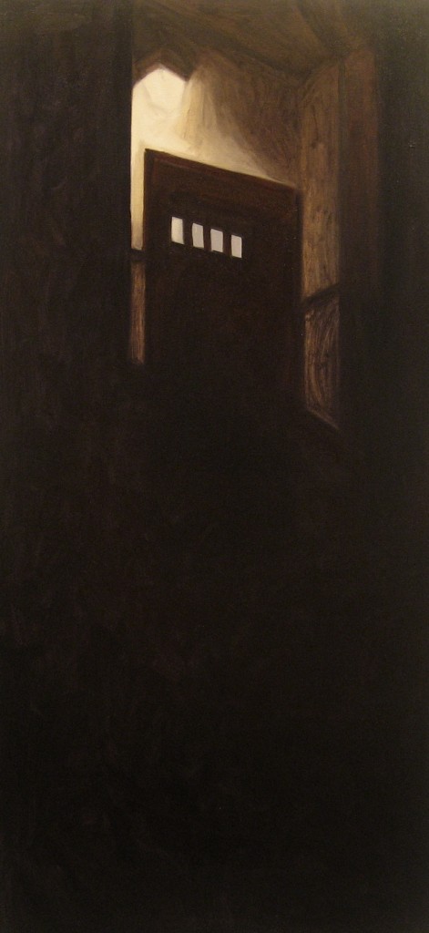
Zabicki demonstrates a keen attention to variations in light, shade, and texture, but her care in the depiction of a surface is often offset by the insinuation of what may lie behind it. When Gwen makes a painting of a sign—something with a simple, straightforward message to convey—the letters are covered with a tarp, or they are midway through being painted, or we’re only allowed to see behind the billboard they’re pictured on, presented with the sign’s structure but not its message. When she paints an apartment building, she conveys a feeling of activity, implied from within the structure but shut-off from us as viewers. This inaccessibility becomes intensified when the barriers and limitations of the structures are reduced to their most brutal geometry. In “Door,” the titular portal stands elevated above the viewer and obscured in the porch’s half-light, its strict form taking on a sense of restriction and authority that’s at once severe and almost comically haughty.

“Door” by Gwendolyn Zabicki
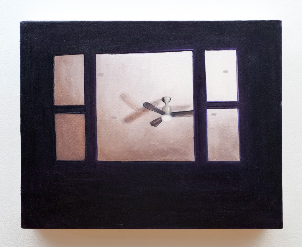
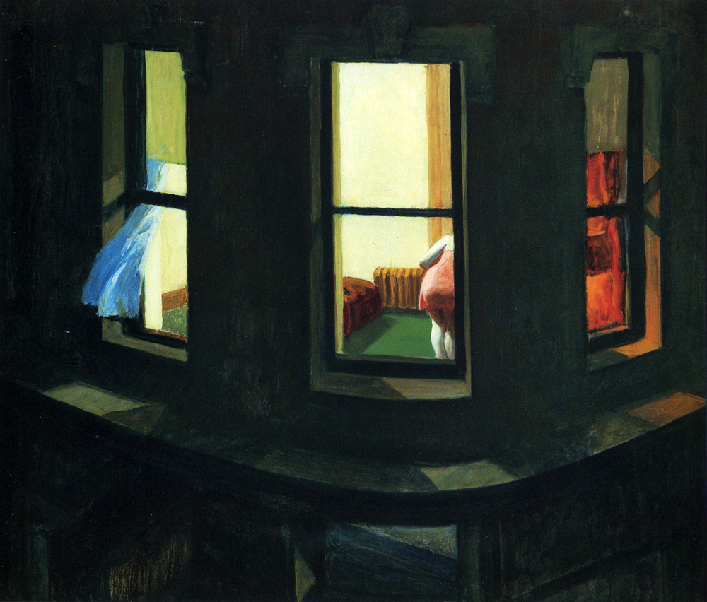
Edward Hopper (whose famous “Night Hawks” must rank as one of the most routinely crowded pieces at Chicago’s Art Institute) made paintings that relied similarly on understatement and implication to convey the oddly alienating feeling symptomatic of living in a place so densely packed with other human beings. But Zabicki pushes this idea to the next level by reducing the evidence we are given of other lives, as well as realigning our perspective as viewers. Compositionally, the paintings are similar to Hopper’s in their skillful treatment of line, artificial light, and geometry. But their take on the urban landscape feels less privileged and far more pedestrian. Rather than the sturdy, salt-of-the-earth caboose of a woman poking into view in Hopper’s “Night Windows,” the only inhabitant revealed by the sidewalk view of Zabicki’s “Kedzie Boulevard” is a ceiling fan. No one can be seen in the room, but the stark light and ambiguous shadows on the ceiling refuse to confirm whether it’s crowded with bodies or stark and empty. The imagination is left to fill things out, putting the viewer in a position of alluring yet mundane voyeurism—immediately familiar to anyone who’s ever glanced up at apartment windows while strolling down the sidewalk. In this way, Gwen’s work is both more restrictive and more collective than Hopper’s, limiting the glimpse we are given into the lives we cannot become part of, but doing so by placing us in a position that’s entirely accessible.

“Kedzie Boulevard” by Gwendolyn Zabicki

“Night Windows” by Edward Hopper
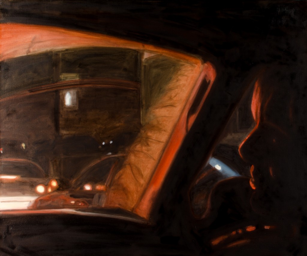
Even in a piece like “Night Driving,” when the composition seems to include the viewer in a less restricted scene, Zabicki is still preoccupied with conveying the conflicts of space (between the internal and external, the accessible and inaccessible, the public and private) generated by ordinary city scenes. As with the wastebasket liner, Gwen undertakes the challenge of capturing light on peculiar surfaces; the way it seems to concentrate on the almost ethereal coat of grime and moisture that has accumulated in the edges of the windshield. In terms of space, “Night Driving” is a sort of inversion of the apartment window pieces: rather than being restricted from the privacy of the apartment, the viewer is oriented as the backseat passenger—a place of relative intimacy compared to “Door” and “Kedzie Boulevard.” The idea of inaccessibility is still there, though. For instance, in the way the light beyond the windshield (emanating from public sources, such as traffic and stoplights) pushes only feebly through the glass, cast onto the front seat passenger, yet only exposing stray planes of his face. Here, the inclusiveness of the setting itself is somewhat restrictive: the composition conveys close quarters for the viewer, trapped in the back seat of a car, shut-off from more collective areas, creating little sense of agency or dynamism. The transience of the situation also adds to the limitation it conveys. The moment is one that can only really be glimpsed, not only because it takes place in a vehicle (in which the longest pause will be the time spent waiting for a stoplight) but also because of the passenger up front: this figure is positioned with casual, friendly reference to the viewer, yet caught in the awkward and short-lived moment of turning (either toward or away from the viewer), with most of the face only implied.
But despite capturing restrictions and barriers, Zabicki’s work is not bleak. Nor is it merely some urbanized version of the pathetic fallacy, a purely impressionistic representation that bemoans, “Look how sad this apartment facade looks!” In her paintings, Gwen seems to be longing for ways to reach common ground and accessibility. The space conflicts the paintings address often convey, not just a sense of lamentation and alienation, but hopefulness that those things can be overcome.
“Everyone knows that feeling,” she says, talking about “Night Driving.” “Everyone’s been in that car.”

“Night Driving” by Gwendolyn Zabicki
While her paintings often depict problems of accessibility and clarity in urban spaces, Zabicki’s work is grounded by an immediacy that feels almost inviting, as if she is determined to create the opportunity for inclusiveness and connection with viewers. Her paintings seem democratic—not necessarily in an all-bets-are-off sense that the paintings can and should be allowed to “mean anything.” Rather, there’s minimal distance between the painting as a physical object of art and the conceptual meaning it contains. Suggesting with a chuckle that artist shouldn’t be made to explain their own work, Zabicki says Peter Schjeldahl was right in his review of the MoMA’s Cindy Sherman retrospective. Describing Sherman’s reaction to demands that she explain her artwork, he notes that she “is remarkably tolerant of interviewers who keep asking her what she means, as if, like any true artist, she hadn’t already answered in the only way possible for her: in the work.”
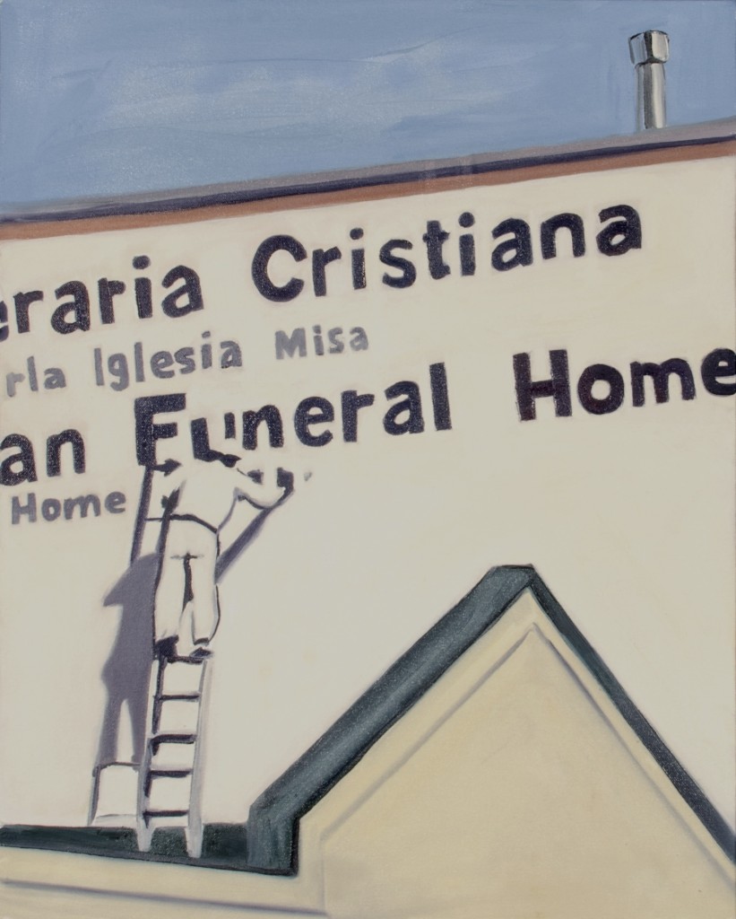
Zabicki’s “Sign Painter” is a good example of a piece that has potential symbolic depth, but in which the elements of composition act as the beginning and end of their own conceptual conversation. In it a painter paints a billboard advertisement for a funeral home. A ghostly shadow trails out from under him. Given that the sign is for the funeral home, it’s easy to see the shady specter trailing out from him as a comment on his own mortality. If you really want to conceptualize the piece, you could also put pressure on the nice, self-reflexive correlation between the commercial painter as a subject and the artist depicting him. An art critic could show them as two peas in a pod, embodying the transience of life and art, the suppression of the working class and the artistic by commercial forces, commodification of the imagination.

“Sign Painter” by Gwendolyn Zabicki
Maybe these ideas are there, but Zabicki’s work seems to evade the temptation to reduce things to easy equivocations (shadow = ghost, or painter = exploited working class, unfinished sign with crooked writing = the unattainability of conceptual ideals in material realms). Rather than a kind of parallel conceptual narrative, the ideas are enacted by the composition and execution of the piece itself. She accomplishes what the best work does, whether it’s highly abstract or dutifully representational. As Schjeldahl says of Cindy Sherman, Zabicki has answered what the work means by producing the work itself. The sense that the man’s shadow conveys his (and our) inevitable demise is inextricable from the paint on the canvas: the frailty of the silhouette, off-kilter from the form of the man, how the shade is tenuously pinned to its more rounded and palpable double. He’s high up on a ladder, set in a dangerous and inevitably short-lived position. For a painting that at first catches the eye as a pretty sunny composition, the man is positioned absurdly close to an immense reminder that death (the sign for the funeral home) towers inescapably over him. The sign, too, is not some sort of coded, symbolic reference to death; if anything it’s literalized to an almost absurd degree, conveying with equal parts wryness, foreboding, and a lack of sentimentality that death, out and about in the middle of the day, is unceremonious and omnipresent. What’s more, the man is hard at work, captive to the task of bringing this reminder of mortality into creation. A recognition that in the action of painting—or shopping, or writing, or kissing, driving a vehicle, having an argument, doing paper work, punching someone in the face, riding in a train, paying a bill, or anything else we do—we are only drawing closer to an arbitrary end. But it’s not a cynical, tortured piece: it’s his job to paint signs, so here he is. It’s what he does for work, how he stays alive in the most logistical, unromantic sense. In the piece, the necessity of living one’s life is tangled inextricably with the futility of living a life that must end. The painting could easily flaunt its interpretability. It could be called “The Physical Impossibility of Death in the Mind of Someone Living.” Instead, it’s called “Sign Painter.”
Like “Sign Painter,” in Zabicki’s work with SLAC, the intellectualized themes and conflicts she is preoccupied with take on material form, becoming embodied by a creative product that acts them out rather than merely standing for them symbolically. The storefront studios are a kind of visual tease, preoccupied with the same sort of tantalizing glimpses as her paintings and creating similar conflicts of internal and external spaces. They make the sidewalk more colorful for pedestrians, but counter the alluring sight of art with the inaccessibility of the space it’s hanging in. Even the invitation to stop and admire the art is in conflict with the reality that next month a new business could move in, or the artist’s stint in the studio will be up. Perhaps most importantly, both projects share a sense of striving toward accessibility, connection, and creation within a community filled with restrictions and densely shared by strangers. While cities abound with opportunities to create some kind of collective meaning, these occasions are often obscured—either because of inaccessibility that seems built into the environment, or simply because establishing a connection becomes elusive in a setting that’s continuously renovating itself throughout any given day. Both SLAC and Zabicki’s work as a painter confront people with the opportunity to reframe these limitations, to become interested and invested in what seems shut off or inaccessible. In each case, there’s the idea that some hidden potential and shared meaning exist in the innumerable scenes of city life that our brains typically file away as the sensorial equivalent of junk mail. Gwen will paint a sign draped in a tarp, but because the sign is under renovation. SLAC searches out vacant window fronts because they’re waiting to be revived and visited—whether by new businesses or works of art.
Needless to say, Zabicki’s paintings and SLAC are not “the same thing,” simply because it would be preposterous to chock up as equivalent the things you do while painting and the things you do running a non-profit organization – not to mention their final results. In each case you face different challenges and hone different abilities: capturing daylight accurately enough that anyone could place it within a specific hour; scouting out a neighborhood’s potential studio spaces; calling the alderman and the building owners; mixing paints to find, not the red of the traffic light, but the red the light makes when cast on the face of a passenger; working with businesses and sponsors to organize fundraisers; painting alone in a studio versus community work that’s necessarily collaborative.
In terms of execution, each project is very different. Yet their affinities should be illustrative to creative types wondering how they can contribute to a world they’re constantly portraying as problematic, but perhaps less inclined to engage with off the canvas—or page, or screen, or through any other medium. SLAC serves as another way for Zabicki to close the gap between the conception of a project and its material enactment, just as she represents certain social and spatial conflicts by painting scenes of city living. Her not-for-profit organization is an example of how world-oriented activist, social, or community work can function as a medium that gives life to different conflicts and themes, doing so as a consequence of the same interests that spark one’s aesthetic work, and exercising a kindred inclination toward observation, preparation, and creation. It demonstrates that you’re not necessarily cheating your muse if, rather than overtly aesthetic compositions, you take time to pursue some sort of social or community work as its medium.
Looking at Zabicki’s paintings in tandem with SLAC could also offer a beneficial change in viewpoint, both to how communities view artists and creative work and how artists conceive of their possible roles within their community. If a painting and a community organization can work through such closely corresponding themes and conflicts, perhaps we need to reorient our expectations of artists and whittle away at the kind of viewpoint that seems determined to separate what we see as poetic and what we consider practical. To stop thinking of them as inherently opposing forces. Maybe seeing creative people as hermitic visionaries that must be sequestered with their genius in order to accomplish anything is as misleading as the other common stereotypical view of artists as ineffectual, work-skirting moochers. This same tension between what’s aesthetic and what’s useful is part of what makes it possible for artists to sidestep secure career opportunities only to avoid the very work that’s most important to them. Trained to view artistic creation in terms of this duality—where it exists as either a waste of time or an aloof act of brilliance—it’s easy for an artist to shy from the task of creating simply because its outcome might prove unworthy of the stability they’ve sacrificed in its name. Just as Zabicki’s aesthetic work seems to blur distinctions between the public and the private, her organization tries to dissolve some of this tension between the practical and the aesthetic. By providing artists with incentive to work within their community, and in turn, for communities to welcome artists as hard workers who can contribute to them, an organization like SLAC renders both the artist and the neighborhood not only more visible to one another, but more accessible.
[1] What is an act of transcendence? Introducing yourself to strangers more often? Trying to set up a neighborhood block party? Attempting to mediate an argument that starts on the subway? Taking time to attend different religious services across the city because it’s a chance to learn about something and watch people actively caring about it? Volunteering at a homeless shelter or after-school program? Picking up trash that doesn’t belong to you, just because it’s there? I don’t actually know what a “transcendent” act would be, really, and for me, the inability to address this distinct kind of social tension with a particular kind of action seems to be one of the problems posed by Gwen’s paintings.
[2] I’ve seen the painting in question. It’s currently displayed in Gwen’s home in south Logan Square, hung near to the floor at a height familiar to waste accepting vessels. Several weeks ago I was visiting her house and at a glance mistook it for an actual wastebasket.
Ben Shurtleff grew up in Massachusetts and completed MAPH in 2011. He lives in Chicago and is currently finishing a novel.


